 get travel marketing tips
 Did you sign up to get Tickled Red, our fun newsletter that shares tourism marketing tips and trends?
No thanks, I don’t need to know new things and I don’t like to laugh.
x principal
Christina Miranda
A highly sought-after keynote speaker in the travel industry, Chris has delivered engaging and unforgettable presentations to tourism audiences around the world. Speaking expertly on topics such as strategic budgeting, guest service, holistic marketing, social media marketing, branding, innovation, and more, Chris has graced the stage for the Chief Marketing Officer Summit of Destinations International, the American Bus Association Annual Conference & Marketplace, the International Association of Amusement Parks and Attractions Annual Conference, the Maine Hospitality Summit, the Hospitality Newfoundland & Labrador Annual Conference and many more.
She’s renowned in the industry for bringing surprise elements and joie de vivre to her keynote presentations, whether flying 875 cupcakes to Newfoundland, crafting an exclusive signature beer for New England, bringing an eight-piece jazz band to Vermont, or an elaborate wedding cake to Maine.
An experiential travel junkie with a cool head in a crisis, Chris has a long history of leading some of Redpoint’s most high-profile marketing and consulting work…from the obscure and quirky to the deadly serious. Her management of the crisis communications response for Simon Pearce following Hurricane Irene’s devastation of Vermont scored a Platinum Adrian Award, while her creation of the Innkeeper for a Day program for the New England Inns & Resorts Association saturated national media with multiple broadcast segments (including a five-minute segment on TODAY) and a host of editorial coverage through syndicated stories and features throughout the country. Her marketing expertise has been tapped by a range of travel industry organizations and brands including Six Flags Great Adventure, Princess Cruises, Tufenkian Heritage Hotels (Armenia), Collette Vacations, New Hampshire Tourism, Denihan Hospitality Group, Smooth Ambler Spirits, Staybridge Suites Hotels, VisitBritain, Grenada Board of Tourism, PEI’s Finest Golf, and many more.
Chris spends most of her time these days running Redpoint and being both the voice of our marketing education blog and the author of our popular travel industry marketing newsletter Tickled Red. Fun fact: she’s also the Chief Consigliere of the renowned jazz band The Hot Sardines and has brought her love of music to Redpoint by founding our Live at Redpoint concert series.

 principal
Victoria Feldman de Falco
Named one of the Top 25 Extraordinary Minds in Hospitality Sales & Marketing by HSMAI, Vickie’s roots in tourism PR and marketing run deep and span every possible hospitality industry segment. Her advice has been featured in leading business media from Entrepreneur magazine to Crain’s New York Business, numerous travel industry media, and even a full chapter in a popular university marketing textbook, Real People, Real Choices, now in its 10th edition.
With more than 40 years of experience in tourism marketing, Vickie has numerous Platinum Adrian Awards to her credit for clients that range in size from globally-known Cunard Line to locally-known Offshore Sailing School. In her career, she’s represented nearly every major US cruise line (and a few European ones too) and has become known for orchestrating for high-profile international events. Her leadership of the A Celebration of Grace events – honoring the 25th anniversary of Princess Grace’s passing – for the Principality of Monaco led to PR success such as a stunning eight-page, glamorous feature in Town & Country. And her leadership of the launch of New York’s Brooklyn Cruise Terminal with Cunard Line led to (among other things) unprecedented front page, above the fold coverage in the New York Times twice in one day…morning and evening edition.
In addition to her practical and strategic planning expertise, what clients most love about Vickie is her limitless and consistent generation of creative ideas. She is the brain behind the Saint Lucia Chocolate Heritage Trail, the Woodstock Inn & Resort’s Tomato Whisperer, and the wildly successful Paint the Town Red program for Kennebunkport, Maine’s winter marketing platform. The staff at Redpoint tap her regularly for brainstorming and creative sessions, and you can find the germ of a “Vickie idea” within the DNA of many of Redpoint’s client initiatives. She created the Sleep Concierge at The Benjamin, the Foliologist at Tauck, the legendary Consumer Advocate at ASTA, and she even had Cunard Line’s Queen Mary 2 deliver the first author-signed copy of J.K. Rowling’s Harry Potter and the Half-Blood Prince to the U.S. in a specially-made steamer trunk.
Throughout her career, she’s led programs for major brands and destinations such as Hyatt Hotels & Resorts, Best Western International, Visa USA, the Finnish Tourist Board, Loews Hotels, Tropicana Resort & Casino Atlantic City, Raffles Hotels & Resorts, Swissotel Hotels & Resorts, Air Jamaica, The Broadmoor, Perillo Tours, Royal Caribbean International, the Venice Simplon-Orient-Express, and many more.
For the record, she’s also our Chief Doodler, and there’s not a scrap of paper safe from her artistic creativity when she’s around. See how she sparked an entire Redpoint trend, including our own coloring book available on Amazon.com. She currently sits on the Advisory Board for Accelerate Women Leaders in Travel.
 vice president
Ross Evans
A Redpointer since 2013, Ross leads the team for all our digital and many of our integrated programs. Clients love his ability to translate complex and elusive digital concepts into layman’s terms. It fosters better decision making and collaboration when clients are fully engaged in both processes and outcomes.
It’s also what makes him an excellent trainer. He’s often sought after by industry associations and DMOs around the globe to educate their stakeholders on digital marketing strategies and trends. From the Tourism Industry Association of Prince Edward Island to the Saint Lucia Tourist Board, he’s often tapped to speak on topics such as email marketing, PPC & SEO, social media, and more. He’s also one of the founding organizers of the US Tour Operators Association’s Annual Digital Marketing Academy, and when he leads Redpoint’s own Marketing Boot Camps, they’re always sold out.
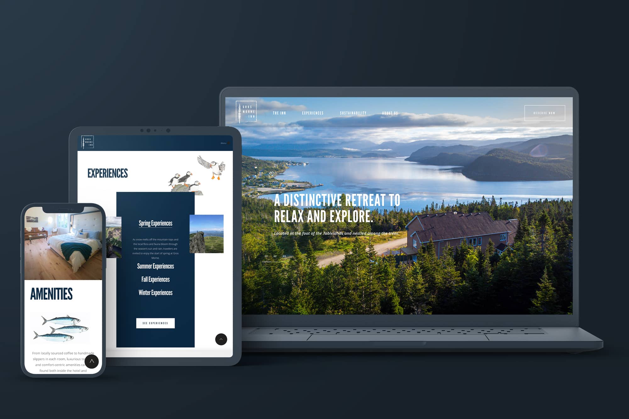
Ross has led the design and development for countless travel and hospitality industry websites for clients such as Learning Journeys, Hotel on North, and Common Man Restaurants, just to name a few. In addition to overseeing the complex digital campaigns for many of Redpoint’s clients such as this one to build awareness for Scotland's St Hilda Sea Adventures in the U.S. and UK market), Ross also spearheads our digital audits. These involve taking a deep dive into a client’s digital ecosystem to evaluate strengths, weaknesses, opportunities, and threats.
Often, Ross lends his digital expertise to Redpoint’s integrated client programs…strengthening the power of PR, rebranding, and multichannel initiatives with strategic digital (and on occasion, training) components. Whether educating the franchisees of Discovery Map International, orchestrating online audits to develop the new brand positioning for the Miramichi River Tourism Association, or supporting annual video engagement campaigns for the US Tour Operators Association, Redpoint clients rely on Ross to shepherd programs to a successful goal line.
An avid golfer with a well-known love of coffee, Ross was the Director of Marketing & Ecommerce for both luxury home décor company Simon Pearce and international footwear company New Balance before joining Redpoint. Fun fact: Ross was our client at Simon Pearce for many years before hopping the agency fence to join Redpoint. So, we go waaaaaaaay back.
 vice president
Gina Dolecki
Gina brings 15 years of PR and media relations experience to her VP role at Redpoint. Since joining us in 2010, she’s become well-known in the industry as an expert in travel and tourism public relations. She’s beloved by North American media and has deep relationships with influential journalists and leading social influencers across the continent.
With her strategic outlook and zest for life, she’s passionately represented clients across all segments of the travel industry. During her tenure at Redpoint, she’s developed a particular expertise for orchestrating PR programs for destinations and associations. These complex assignments require deft management of multiple stakeholders and constantly shifting goal posts to achieve PR goals. She handles all such challenges like a champ, bringing media success to clients such as the United States Tour Operators Association, Atlantic Canada Agreement on Tourism, the Principality of Monaco, Tourism Nova Scotia, the Student & Youth Travel Association, Miramichi River Tourism Association, and many more.
Her work with Redpoint has thus far brought her to five continents (fear not Australia and Antarctica, it’ll happen) and has led to high profile media coverage, strategic brand partnerships, and billions of views and social/online impressions for clients. She’s fond of the quirky angles, and some of the quirkiest have won coveted industry awards, such as driving FIAT cars on the water in PortMiami to launch the MSC Divina’s arrival in the US for MSC Cruises, having Mount Rushmore carved into a six-foot block of cheddar for Ripley’s Believe It or Not! Times Square, and throwing a 1st birthday party for Kong at Morey’s Piers & Beachfront Waterparks.
A long-standing and engaged member of the Society of American Travel Writers, Gina continually cultivates new relationships with journalists across all mediums and she encourages those she mentors to do the same. She’s trained a significant number of Redpoint’s PR staffers and is a natural coach on the subject of media relations. Her workshop on PR strategies and trends at the Vermont Tourism Summit was widely attended and received rave reviews. OK, she DID give out candy, but that was just a bonus.