You want to inspire bookings now, it’s true…but landing a spot on someone’s travel bucket list is an equally worthy marketing goal. And since we all aren’t lucky enough to be “the Grand Canyon,” “Petra,” “Mount Everest,” “The Taj Mahal,” or any of their popular bucket list cousins, most of the time, we need to work to earn that spot.
Is the amount of work you need to do worth it in the end? Hell yeah, it is. Let’s break it down.
This post will cover why this should be among your marketing goals, what you can do to be bucket-list-worthy, and how to ignite proper interest in what you’ve got to offer.
FIRST…WHY?
This is different than just marketing for long-term brand awareness. This is marketing a SPECIFIC thing that acts as bait to hook potential travelers’ interest. That “thing” is what goes on their bucket list. YOU are just the access granter. And when you get on someone’s travel bucket list this way, you:
- Cultivate future revenue
- Create absurdly compelling content for your ongoing marketing efforts
- Make yourself newsworthy
- Turn people into ambassadors long before they even book their trip
People LOVE talking about what’s on their travel bucket list. They tell friends and family about you, obsessively share photos, post on social media about it, and do a ton of ongoing research. These are the folks who sign up to follow your social channels and get your newsletters before they ever grace your doorstep. They generate repeat website visits and help goose your social algorithms with enthusiastic engagement. In effect, they wield a tremendous amount of marketing power for you.
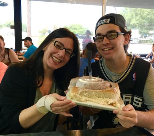
Case in point: my nephew and I talked about this 3.5 pound cinnamon roll served at Lulu’s Bakery in San Antonio, Texas, for nearly two years before we planned a trip there in 2016 to eat it. Sure, we did other things once there, but the driving reason behind choosing San Antonio for his birthday trip was – literally – to eat that cinnamon roll. Heads up dessert lovers…Lulu’s has since closed, but that giant plate of sweet goodness is now available at Green Vegetarian Cuisine, the restaurant owned by Lulu’s son.
The point is…things that are bucket-list-worthy don’t have to be big, nor expensive. They just have to be out of the ordinary enough that someone would have to consider traveling to you for the experience.
SECOND…WHAT?
If Lulu’s didn’t have that cinnamon roll, would I even have heard of that small bakery/diner in San Antonio? Nope. But it’s so unusual and makes such a fabulous visual that the first time I saw a video about it on social media, it stopped me in my tracks. And I immediately saved it to plan a future birthday trip for my cinnamon-roll-loving nephew. It was never a matter of “if”… it was always a matter of “when.”
To get on someone’s travel bucket list, you need something that does the same thing as that cinnamon roll: stops people in their tracks and makes them immediately say, “I’m going to do THAT someday.”
Just existing, or existing near a popular travel bucket list spot (like the Grand Canyon), or offering a bucket list experience that many others offer (like an African safari or skiing the Alps) isn’t enough. Why are YOU the right access-granter of that bucket list thing they want? What sets you apart and earns you that coveted spot?
If you don’t already have something worthy in your arsenal, here are five categories you should consider exploring:
1. An experience that’s rare or (if this is even possible) completely unique.
Adventure, learning, culture, culinary…your canvas here is limitless. Outrageously decadent or expensive meals. Exclusive interaction with experts for learning opportunities. Behind-the-scenes access that’s not usually available. Things like this can all be achieved through creativity, collaboration, and/or a willingness to sort out logistics. From the 24 karat gold pizza at NYC’s Industry Kitchen to the extraordinary Stargazing Over Hirundo program (with legendary astronomer and planetarium innovator Shawn Laatsch) at Maine’s Hotel Ursa, it’s just a matter of dreaming something up and figuring out a way to make it happen.
You can also bundle together things that, alone, are no big deal…but together, they make an unusual experience for someone’s bucket list. Like the Tour de José at the Ritz Carlton New York-Nomad, which is a private, guided evening through all four of José Andrés’ four dining experiences within the property.
2. An annual event that stands out.
You don’t have to be a huge, internationally known event (yet) to get on someone’s bucket list. Quirky, interesting, bucket-list-worthy events come in all shapes and sizes. When Nova Scotia’s South Shore region created their Lobster Crawl event several years ago, it was a small event with a few casually planned happenings over a weekend in February. Now it’s the entire MONTH of February with robust programming. (Side note: I personally know several lobster lovers who have this event on their bucket list.)
The town of Woodstock, VT, is on a similar path, having just launched their annual Pride of Woodstock events in June 2024. Trust me…that wild High Heels Race through the tiny village of Woodstock with its charming covered bridge and lush town green? That’s ALREADY on people’s bucket lists for future years. Even smaller, but no less worthy…the Inn by the Sea, renowned for welcoming pets, has a fabulous annual tradition. For the last week of summer before their outdoor pool closes for the season, the pool is open for dogs to swim, which is a rare opportunity at a hotel. So, you can make a bucket-list-worthy annual event out of just about anything if you get a little creative.
3. An arresting visual worth traveling for.
If there’s a bucket-list-worthy visual that occurs naturally in your area, you need to make it easy/extra-enticing for make you their access-granter. For example, travelers can see the Northern Lights from many locations around the world, but at the Kakslauttanen Arctic Resort in Norway, they can see them from the comfort of their breathtaking domed igloo accommodations. If there’s something cool nearby or within your region, you just have to link yourself to it in a way that’s exclusive to you. Think tailor-made packages to see area sights, special access, or just offering it differently than others. Several tour companies offer jaguar safaris in Brazil…but Caiman Ecological Reserve offers nocturnal safaris, which is when jaguars are most active.
You can also make your own bucket-list-worthy visual. And don’t forget, these aren’t just landscape/nature oriented. It could be anything that makes an arresting visual that the traveler would want to see with their own eyes…and likely wants to post a photo/video of on their social channels. The aforementioned 3.5 pound cinnamon roll qualifies here. The 2-foot tall soft ice cream cone at the Hampton Chocolate Factory in Tampa, FL also qualifies. Think: food, drinks, art, décor, products…how can you create something with a stand-out visual that people just HAVE to see for themselves?
4. Something that aligns with fanatics, hobbies, or pop culture.
This is another limitless canvas. When someone has a deep passion, they are usually willing to indulge it with time and money. Cocktails, sports, art, books, knitting, music, ethnic foods, comfort foods, science, movies, fashion…there are a zillion angles here to tap.
Themed rooms at hotels, experiential trails in a region, exclusive sightseeing/behind the scenes experiences, extraordinary dinners, and more…pretty much any destination, accommodation, tour company, and cruise line can find something to offer in this category.
For example, the Kentucky Bourbon Trail is a natural mecca for bourbon lovers. But now they can stay at The Trail Hotel, a new luxury property that offers a deeper connection to the spirit, including Bourbon Butlers onsite and eight specialty bourbon-themed suites.
And I’m a HUGE fan of pierogi, so you’d naturally think Poland is on my bucket list, right? Sorry Poland, you’re lovely and all, but I read about the Manitoba Perogy Trail a few years ago and it immediately went on my travel bucket list.
The great thing is that to lean into this particular bucket-list category, your entire being doesn’t have to play along. It could be one room of a hotel, one table at a restaurant, one day each month, or one corner of your region. Remember, this isn’t about aligning your entire identity with the angle for long-term brand marketing. It’s about using a SPECIFIC hook as bait to get on someone’s travel bucket list.
5. Stunning dramatic architecture and/or interior design.
This too doesn’t have to be true of your entire being, but certainly entire hotels have been built around bucket-list-worthy architecture and/or interior design. Case in point:

- The glass & steel accommodation pods, or “ovo,” set into the vertical rock surface at the Ovo Patagonia in Argentina (above).
- Stunning cave accommodations in Matera, Italy, like the Sextantio Le Grotte della Civita.
- Accommodations at the Jamala Wildlife Lodge, set within the Canberra, Australia, National Zoo & Aquarium, where each room has glass walls abutting the wildlife enclosures. (Yes, you can take a bath while watching tigers roam two feet away…just remember they are watching you back!)
- At Winvian, in Connecticut’s Litchfield County, you can stay in a helicopter, a treehouse, a greenhouse and more. Each of their 18 accommodations is completely unique.
- The Biosphere accommodation at Treehotel in Sweden is suspended in the air among the trees and adorned with 340 birdhouses on its exterior. It’s utterly WILD to look at from the ground too.
But you can get on someone’s travel bucket list using architecture and design without needing an entire hotel/building specially designed for it. Luckett Vineyards in Nova Scotia placed an iconic red British phone box smack in the middle of their vineyard. The Common Man Inn & Spa in Plymouth, New Hampshire, has a handful of adorable and photogenic “tiny cabins” nestled into the landscape. Saybrook Point Resort & Marina in Saybrook, Connecticut, has a Lighthouse Suite located out on one of the docks at the marina. All you need is just ONE thing to promote within this category and you’ll have the chance to hook future travelers.
Offering anything among these five categories can get you a spot on someone’s bucket list, so you’ve got a lot of latitude to find something that works for you operationally/logistically. And if your bucket list item taps into more than one of these categories simultaneously, it’s even more powerful.
AND THIRD…HOW?
It’s like that old saying, “if a tree falls in the woods, does it make a sound if no one is there to hear it?”
You can’t ignite proper interest in your bucket list “thing” unless you promote the hell out of it. You’ve got to dangle those lures in order to catch the attention of those who might be interested. And if you’ll forgive me while I take that analogy one step further, you’ve got to fish in all the right ponds.
Whatever your bucket list item, the most crucial thing you can do is invest in stellar visuals – photos and video. Because those visuals are the best bait you can use to hook bucket listers. Visuals are essential for both traditional media (because every journalist will want them to accompany their story) and social media (where dramatic, unexpected visuals “stop thumbs from scrolling,” and boring visuals get lost among the clutter).
If you need a nudge on this, we’ve got two: The Secret to a Great Tourism Photo, and What Makes a Dramatic Tourism Marketing Photo?
The better your visuals, the more they’ll get shared. So if you spend a ton of money and time investing in your bucket list item, and then DON’T spend money and time capturing them visually for sharing…dude, that’s fumbling at the goal line. When your bucket list item gets no love, you’ll have no one to blame but yourself.
Here’s a helpful checklist to ensure that your bucket list item has the best chance of nailing a spot on people’s lists:
- I repeat: invest in stellar visuals.
- Ensure information about it has a permanent home on your website with an easy-to-share landing page url, so that you, journalists, influencers, and potential guests can (duh) easily share it. If it’s something seasonal and you only have it on your website during that season, you’re missing out on year-round discovery opportunities.
- Share it with traditional media through a PR strategy. (Oh, you need one of those? We gotcha.)
- Share it through your newsletters and on your own social media…and do what you need to do to boost and amplify those posts. (Oh, you need a strategy here too? We gotcha again.)
- Share it with social media influencers – choose them strategically and let THEM amplify your message with their own visuals and storytelling. (Oh, and this too? We still gotcha.)
- Investing to host journalists and social media influencers to experience your bucket list item seems like spending a ton of money with no guarantee of return – especially if it’s an annual event. But that’s an INVESTMENT you need to make, which will pay dividends over time. So do it.
- If your bucket list item aligns with certain passions, hobbies, and interests, you’d be wise to stop and think: where do those people congregate? There are social media groups you can post in, niche media you can tap, special interest groups that have their own newsletters/magazines/websites…heck, even in-person meetings and conferences. Like, should New Zealand want to attract even more Lord of the Rings fans than it already does, they might consider taking a booth or sponsorship at Comic Con, where tons of LOTR fans flock regularly.
The bottom line is this: to get on someone’s travel bucket list, you need to have something rare or unique and be bold and creative in sharing stories about it.
Developing ideas like this is – quite literally – my favorite thing to do at Redpoint. So if you want to bat around some ideas, just holler anytime. I’m game! Drop me a line here.
 get travel marketing tips