get travel marketing tips
 Website design
It’s a common story for longtime trade associations: as programs expand and audiences diversify, websites accumulate digital cobwebs. Even the most sophisticated sites eventually wrestle with the same usual suspects…stale assets, aging content, scattered resources, and a little design dust. The United States Tour Operators Association (USTOA) website was no exception, and they turned to us for help.
First, we had to understand their current needs and goals for a new site. Would it need a light touch-up or a full redesign? Redesigning most sites (even small ones) can be a HUGE undertaking, so before we define timelines or plans for these types of projects for clients, we start by thoroughly assessing every nook and cranny of their digital eco-system…from technical performance, functionality, and visual design, to content quality, navigation, and user experience. So we began with a full website audit and determined that:
- A redesign wasn’t just desirable, but essential. They’ve taken excellent care of the site, but it simply outgrew itself. Further patches, add-ons, and retrofitting were no longer an option. A new design and revamped website infrastructure was needed to better showcase USTOA and effectively serve their audiences. Speaking of audiences…
- The main challenge was: how to better streamline the delivery of resources. USTOA’s website needed to 1) serve three different groups (members, travel advisors, and travelers), and 2) present complex information (educational resources, details about events, sustainability practices, and industry standards) in a way that’s easy to find, engaging, and accessible to everyone visiting the site. And so…
Armed with this knowledge, we mapped out a new path forward for the website, and as soon as USTOA leadership gave their nod of approval, we were off and running.
We implemented a series of targeted solutions centered on this goal: to simplify and enhance the overall user experience.
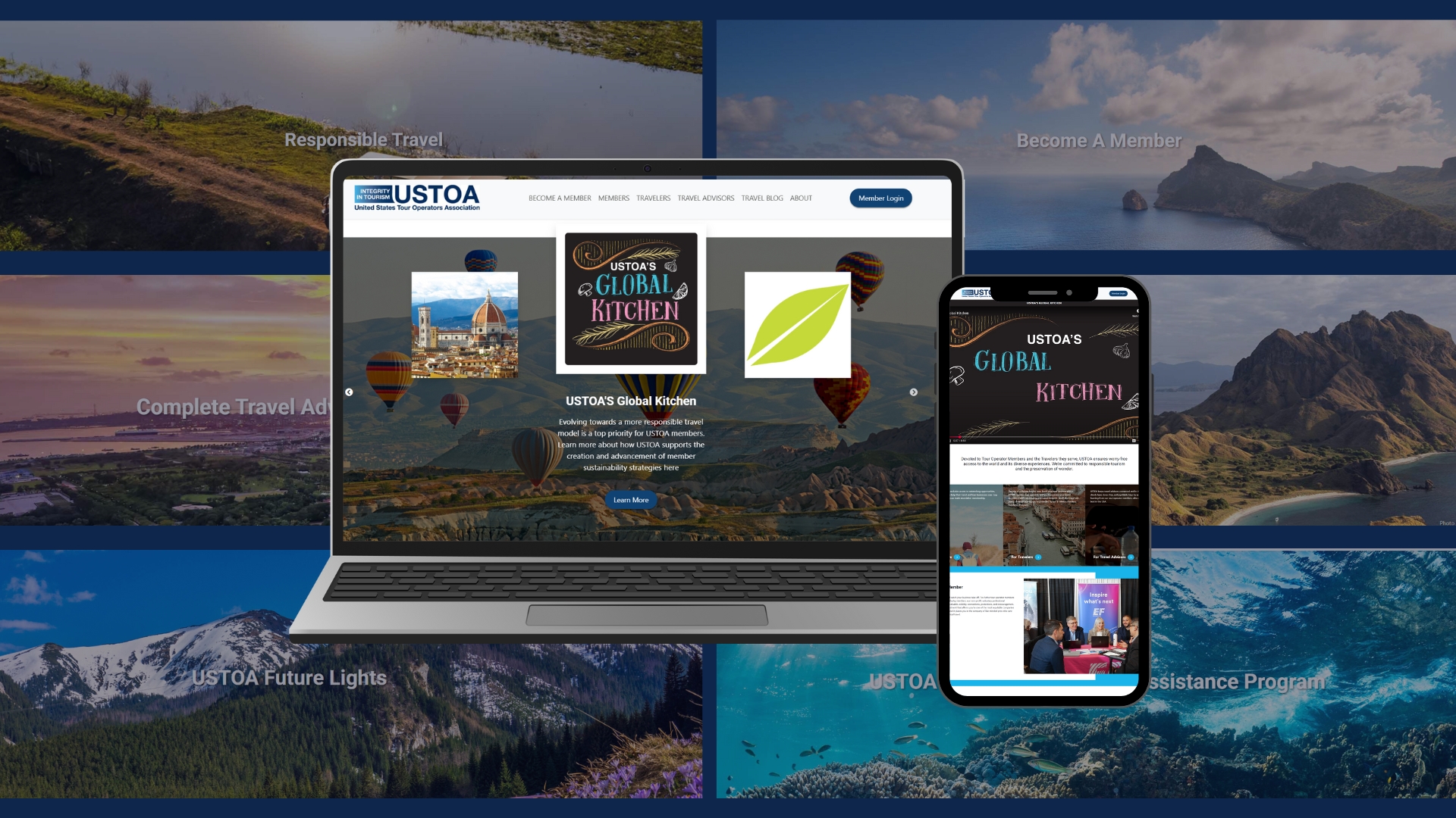
With multiple audiences to consider, maintaining clear and consistent messaging was a top priority. We simplified the top navigation and created distinct hubs for members, travel advisors, and travelers. The result is a more intuitive flow that helps users find what they need faster.
We also refined existing website copy to better reflect USTOA’s mission, clarify its value proposition, and point each audience to tools and resources designed for them. Additional enhancements included adding filtering capabilities to USTOA’s popular travel blog and reducing clutter by streamlining design and structural elements, creating a more readable and consistent experience. Users can now find more of what they need on each page, without having to navigate across multiple pages, and the content feels more intentional and relevant.
While the front-end got a fresh polish, we fine-tuned the backend to ensure the website is juiced for SEO/GEO. On-page elements and keywords were optimized to improve search engine and LLM visibility, speed, usability, and scalability across various devices.
To enhance the visual appeal, we added fresh video content and eye-catching travel photography to improve user engagement and dramatically elevate the site’s overall look and feel.
Since launching the new website, results show a significant improvement in user engagement, including the number of active users and improved session metrics.
In the first year:
- Overall visits to the website are up 82%
- Organic search engine traffic jumped 38%
- Visits from users who started their search on an AI engine increased by 730%
- Traffic to the USTOA travel blog increased by 65%
More USTOA website visitors are clicking through, interacting with pages, and accessing resources. Oh, and leadership? They’re LOVING the new site.
Our partnership with USTOA expands far outside the digital marketing realm. Learn about the annual consumer marketing campaigns we orchestrate for them in this case study.
Want to see more examples of our web design work? Here’s a website we built for a luxury eco-lodge, The Gros Morne Inn.