PR is essential in tourism marketing.

February 28, 2022

PR is an essential part of the marketing mix for tourism.  So says Redpoint, and you may think we’re biased because public relations is one of the marketing services we offer to the tourism industry.  But the facts bear out our claim, and it’s largely due to two critical benefits of PR:  reach and search.

Having been involved with tourism PR for 30 years – before the internet was even really “a thing” – I can attest that, like anything, it has always had its supporters and detractors.  Supporters tout its ability to shape and even change a brand’s image, and its success at building awareness, sparking bookings, and mitigating crisis.

Detractors, however, are most often hungry for a more tangible and immediate ROI.  Editorial coverage is never guaranteed, and even when it happens, the direct impact on sales isn’t always traceable.  Someone could read a story about your destination or hotel in The New York Times this week, but not act on it until next year.  So yeah, that story made an impression on them…but you may not be able to PROVE that story was the origin or even a contributing factor.

But while it’s true that investing in PR does require having a little faith in intangible results, social amplification and online promotion by news media reward that faith with some deeply tangible bite.  And you can see the results in your own website stats.

This is all due to the glorious PR benefits of reach and search.  Let’s take a look.

REACH

Let’s say you launch something and promote it on your own channels (email, socials, website, etc.).  Your channels only reach so wide (for example’s sake, let’s say that’s an initial audience of 300,000), and your budget only goes so far to help amplify that story.

Then a high-profile media outlet writes about your story.  And since that media outlet’s entire mission is to get visitors to its website (to attract/maintain advertising budgets with impressive web stats), it shares that story on all its social channels and in email newsletters to its subscribers.  Their initial combined audience may be in the multiple millions, but at the very least is far likely to exceed yours and certainly extends beyond it.  And if that story is picked up by dozens of media?  The amplification grows exponentially.

One Specific Example:  Last February, we helped the New England Inns & Resorts Association score a huge feature story in The Boston Globe.  It promoted “Winter Beyond Skiing” and directed readers to a landing page with packages.  The Boston Globe ran the story online, in print, through email, and on Facebook during the weekend of Feb 5-7.  Here’s what the association’s website saw as a result.

Comparing 10 days before and after Feb 5:

  • Page views to the landing page were up 226%.
  • Direct traffic to the landing page had a 488% increase in users.
  • The hotel with the lead offer in the story saw a 1,000% increase in users visiting its offer on the association’s website.
  • Overall traffic to the site saw new users up 14% and sessions up 13%.

That landing page had already existed for a month prior to that weekend.  The Boston Globe story just turned a powerful spotlight on it, helping extend its reach to both a broader and relevant audience.

Hot Tip Takeaway:  If you want to better track the impact PR is having on your overall marketing success, make use of landing pages for story angles where possible and always check your web stats for spikes after key stories run.  Not only does it underscore some of PR’s immediate and tangible results, it also could reveal useful potential media candidates for spending ad dollars wisely.  If it’s clear a media outlet’s audience finds you relevant, then consider dropping your paid ad line in that pond, where the fish like your bait.

SEARCH

In many cases, media outlets and relevant blogs are likely to have far greater success with search results than your individual business will.  This is due the way search engines like Google rank a site’s authority, which is born of everything from how frequently searches find satisfaction in their site’s search result to volume of overall users.

Search engines are notoriously secretive on their ranking cocktail ingredients.  But suffice it to say, for many types of searches, it’s far more likely that – say – a story that includes you in Travel + Leisure will appear higher in search results than your own website’s blog post.  And even if your own website ranks highly in search results for that subject, wouldn’t it be awesome if you were also mentioned in most of the items on the first three pages of search results?  In that way, a slew of different search results on the same topic will lead to YOU.

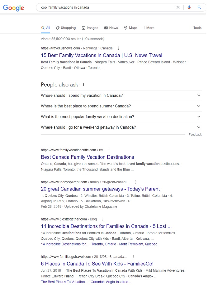
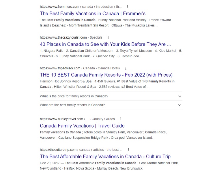
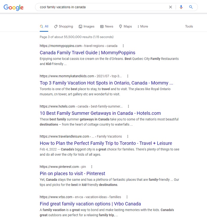
And with consistent, widespread PR outreach…they can.  Case in point:  There are plenty of hotels and regional destinations in Canada that offer cool vacations for families.  Yet, with a search done for “cool vacations for families in Canada,” none of them turn up on the first three pages of organic search results.  But look at what DOES turn up:

A page of google search results for cool family vacations in Canada.

A search results page from google showing cool family vacations in Canada.

A page of search results from google showing cool family vacations in Canada.

Parenting travel blogs, media outlets, the blogs of booking sites…they’re ranking higher in search than specific hotels or destinations, even if those places have a blog post on their websites about how awesome they are for families.

Hot Tip Takeaway:  It’s only natural to crave the BIG feature stories in PR, but don’t look down your nose at small mentions, especially in round-up articles like the ones featured in the above search results pages. Editorial stories in media outlets that highlight “the best of this” or “the coolest that” do exceedingly well in search results and could lead a ton of highly relevant visitors to your website.

The bottom line is that, with online and social amplification lending its power to the equation, PR is more essential than ever in tourism marketing.  If you’re not doing it, or doing it inconsistently, you should definitely consider exploring how it can help grow your business.  Because even if you’re not…your competitors are.

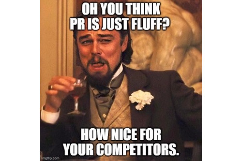
A meme showing Leonardo DiCaprio raising a cocktail glass with the text Oh you think PR is just fluff? How nice for your competitors.

Not sure where to start?  Check out our experience and give us a shout.  No strings…we’ll just talk you through it.

The secret to a great tourism photo.

October 26, 2021

Tourism is a highly visual industry.  Photos are a key tool used to tell tourism stories, but there’s a secret behind the great ones that make the biggest impact.  Someone took the time (and often, money) to get it right.

More dramatically put:  someone resisted the temptation to use photos that were easy to get but kind of “meh” in terms of quality.  “Meh” photos serve the functional purpose of photography, but they are completely uninspiring and make no impactful impression on the viewer.  So, yeah…you have photos to put on your website.  Check that box.  But are they seducing site visitors into considering a trip?  That box stays unchecked.

Fear not, there are a whole bunch of “great” and “meh” photo examples down below.  But first…

Sucky (and Silent) Consequences of Using “Meh” Photography

When tourism businesses choose to settle for “meh” photography, it causes much heartbreak.  Throughout my career as a tourism publicist and marketer, I’ve seen:

  • A hotel client who lost a highly-desired Architectural Digest story about their opening launch because their photography wasn’t good enough. (AD wasn’t being snooty…their photography was NOT good enough.)
  • Another hotel client whose online booking conversion rate absolutely sucked…and a website audit revealed that people were leaving the site after looking at the photo gallery. (Tragic, as a photo gallery should inspire people to hit the “book now” button.)
  • A destination client who was included in a syndicated news editorial round-up…and the only one of the eight destinations included without a photo accompanying their blurb because their photo wasn’t “quite right.” (Seven destinations with glorious vibrant photos and only one with just text… which one do you think got overlooked by readers?)

But those are examples where the consequences were traceable and known.  Far more dangerous are the silent consequences of “meh” photography.  No one ever leaves your website unimpressed and without booking…and then calls you up to say, “hey, I was considering a stay at your hotel, but just wanted to let you know that the photos didn’t really sell me on the place so I just left the website without booking.”

So, the bottom line is…you don’t even know how many sales you’re NOT making because your photos are just “meh.”

But trust me.  If they’re “meh,” it’s happening.

Why Is This So Hard?

Why do so many tourism businesses settle for less-than-great photos to use in marketing?  Three common reasons.

  1. They feel it takes too much time and they don’t have the bandwidth to organize/oversee it.
  2. They don’t want to spend the money for a photographer and/or stylist.
  3. They don’t understand the difference in impact between a “good enough” photo and a “great” photo.

It’s a real head-scratcher to me, but I’ve seen clients spend $20-$30 million building a gorgeous hotel, and then fight with me about spending $20,000 on photography for the website, brochures, and socials.

In other scenarios, I get the… “My sister-in-law takes great photos as a hobby – you should see her Instagram.  So I’m just going to have her do all our photography.”

Or the… “I don’t have photos of THAT specific program even though that’s what we’re promoting, so can we just use a general photo instead?”

Or the… “These brochures are really old and our hotel rooms don’t look like that anymore, but that’s all we have so just use those at the trade show.”

To spend all that money building your business and brand, and then NOT spend the money on a professional photographer to produce photos that help you sell it?  That’s fumbling at the goal line.  And it’s sabotaging the ROI of all the money you spent on building the business itself.

What Should a Great Photo Do?

A great photo is like an assist in sports:  it should assist you to close a sale.  That assist might come in the form of (for example)…

  • An Instagram photo that stops thumbs while someone is scrolling and makes them want to explore your entire Instagram profile…and ultimately your website.
  • Photos on your website that evoke emotion, inspire a desire to visit, make them want to check pricing and logistics for a trip.
  • Photos in a magazine that arrest people’s attention as they’re flipping through the pages and make them want to read the accompanying editorial story…which hopefully makes them want to visit your website.

Here’s a great case-in-point.  Years ago, I was in Armenia with a photographer getting shots of a collection of new boutique hotels launching that year.  We had no staff with us (literally no staff – the hotels weren’t even open yet) and no stylist.  It was just her and me trudging around the countryside with tons of photography equipment.  And FYI – while I’m eager and helpful, I know zip all about being a photographer’s assistant.

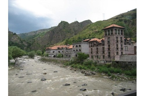
Here’s what one of the hotels looked like, with a simple “point and shoot” approach.


A castle-like building sits beside a rushing river and in front of green mountains.


It DOES look like a historic castle, and you DO see it’s right next to a rushing river and nestled in the mountains.  So, it definitely gives a sense of place and is “ok.”

Here’s what it looked like when the photographer got done with it.

A nighttime view of a castle-like building with dramatic lighting, which sits beside a rushing river and in front of a backdrop of mountains. This is the secret to a great tourism photo.


Listen, folks.  This was NOT a simple point and shoot.  We had no cell service and no radios to communicate with each from opposite sides of the river, and crossing that river was no picnic either.  Her trying to signal to me which lights to turn on or off, which umbrellas to move slightly left or right, and could I tilt that ONE light on the side to angle more toward the patio?  No, not THAT one.  THAT one.

Getting this shot took HOURS.  Actually days, because we had weather issues intervene.

But look at those two photos.  Which one stops your thumbs while scrolling and which one makes you say “OMG that place looks breathtaking and I want to go there?”

Great photographers do more than just click a button on a camera.  They harness the power of lighting, tone, context, perspective, props, spatial relations, and emotion.  In this case, the photographer studied the situation and said, “what photo…what angle…what perspective…what styling is going to show this building in the best, most seductive, most appealing way?”  And after taking a lot of test shots from various positions at various times of day, this nighttime photo won the honor.  (Should I mention how many design and travel magazines made this photo their centerfold?)

I mean…if your sister-in-law can do all that, then by all means lets hire her.

What’s My Point?

Getting great photography isn’t easy.  It takes time, planning, and commitment.  You may need to invest in props and other items to achieve the objective… flowers, food, drinks, people, and more.  You may need to reschedule (and spend money on a wasted day) because of weather.  If you’re already open, you may need to clear entire public spaces for several hours or a day – losing revenue from paying guests who don’t have access during that time.  You may need to take a shot over and over and over and over again to get it just right.  And damn it, you definitely need a professional photographer and/or stylist to do it justice.

Yes, all that costs time and money.  But the difference between “meh” photos and “great” photos is entirely about MAKING MONEY.  Skimp elsewhere if you must.  But do not skimp on great photography.

To further illustrate the difference, here are a few examples of photos I’ve come across in my tourism work.  Some of these businesses know the secret to a great tourism photo, and some clearly don’t understand what makes an impact.

By the way, there are deliberately no business names here.  This isn’t a commentary on who’s doing it right and who’s doing it wrong.  It’s an objective look at how photos do or don’t make a worthy impact.

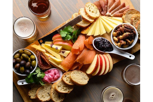
Everything about this charcuterie board screams “dig in.”  Lighting, color, texture, positioning.  This delicious photo was no happy accident.

A charcuterie board of food including apples, cheeses, veggies, crackers, nuts and more. This colorful, vibrant, well-light view is the secret to a great tourism photo.


This cocktail gets completely lost in this photo.  It’s a gorgeous color, but sitting on that similar colored surface, the vibrancy doesn’t pop as it should.  Plus the background is super distracting.  If you’re a DIY Instagrammer for your business, and just taking quick snaps like this “on the fly” for posting, at least do this:  take that glass and snap pics of it in in a few different settings, and from several angles – high, low, above, side, etc.  If you take a dozen photos of this cocktail – which can be done in just a few moments – you’ll immediately be able to spot the one that shows the cocktail off to its best advantage.

An orange colored cocktail sits on an orange colored surface.


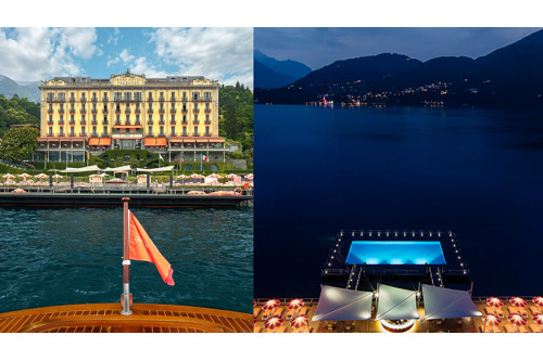
Let’s talk about dramatic architectural features, such as floating pools.  We once had a client that was debuting a floating pool and they fought us like the very devil about getting overhead drone shots of it.  They didn’t have easy access to a drone and didn’t want to pay for it.  But honestly, a straight-ahead shot of a floating pool just sucks all the drama out of that super-cool architectural feature.

To illustrate, here’s a picture at another hotel of their floating pool taken from different angles.  You can see how one showcases the floating pool and in the other, it gets lost.

Left side shows photo of a large, many-windowed hotel, with a floating pool sitting in front of it. Right side shows that same floating pool at night, from an elevated perspective so the light blue of the pool glows brightly sitting inside the dark blue lake.


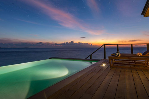
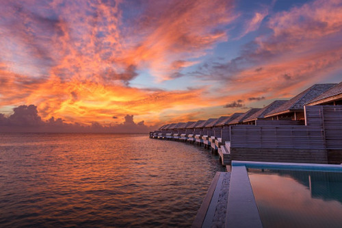
And these folks REALLY did their floating pool villas justice, ensuring their website gallery shows them from multiple angles and various times of day:

This captures the secret of a great tourism photo. A floating pool sitting on the edge of the ocean, with an attached deck that shows two lounge charis.


From the perspective standing on a deck looking out at the edge of a floating pool and the Indian Ocean just after sunset.

Standing on the edge of a floating pool at sunset, showing the perspective of multiple villas with their own floating pools stretching out before you. Sunset of bright orange, yellow, and purple.

From the perspective of laying in bed, looking out terrace doors to a deck with table and chairs, aqua colored floating pool, and the deep blue ocean.


Food shots need special attention because visuals aren’t necessarily the main sensory trigger for humans when it comes to food.  Taste, sound (sizzling, pouring, sauteing, etc.), scent, and texture all play a role in our emotional connection to food.  And that’s hard to communicate in a flat photo.

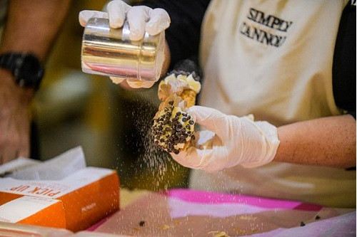
Here, capturing sugar in mid-shake on this cannoli gives more energy, life, and interest to the photo than just a static pic of a cannoli.

A person shaking powdered sugar onto a cannoli that's covered with chocolate chips.


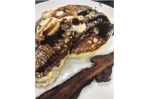
But these pancakes are nearly unidentifiable in this photo.  In the quest for a close-up to show the dripping, oozing goodness, perspective gets lost here.  If you’re scrolling quickly, you can’t even tell what it is, and that super-crisp piece of bacon on the side doesn’t help… it almost looks like the pancakes are sitting on a wood shelf.  Perhaps backing up the camera to show the whole plate, and catching the moment when the chocolate syrup is being poured onto the pancakes might achieve the objective better.  But – you know what I’m going to say – try it a dozen different ways before deciding which one makes the right impact.

A close up photo of pancakes with bananas and chocolate syrup on them and a crispy piece of bacon on the side.


Oh, you’re taking pictures of animals?  NEVER just snap one-and-done.  You take tons of photos from multiple angles in order to get one that will stop people in their tracks.  Like this:

Picture of a baby lamb facing front and smiling.


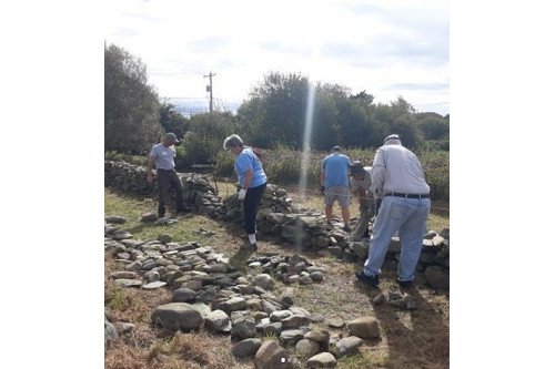
And finally, these folks are rebuilding a really important and historic wall.  But this photo will stop no thumbs.  I’m sure the dude on the right won’t be pleased that his behind is on Instagram, and everyone milling around looking down at rocks doesn’t do the story justice.  A close-up of a volunteer holding up a piece of rock with a huge smile on his/her face… or better yet, faux-kissing it?… could better tell the story of the passionate volunteers involved.  Or have him/her sitting on the wall and get enough context in the shot to see “kissing the rock” and the wall itself.  Or… hey, I’ve got an idea… take a dozen different shots and see what works best.  😊

Five people standing around piles of rocks, some of which are half-formed into a stone fence.


So, in conclusion, please do what it takes to get great tourism photos.  There’s really no secret to capturing ones that make an impact… just spend the time and/or money to do it right.

And let me just clarify:  by “great,” I mean photos that achieve your objective of inspiring people to emotion and action.  “Great” is one of those vague words that always need clarification and shame on me for using it so liberally in this post.  See why you should be careful using that word here.


Is being the Google Featured Snippet always a good thing?

August 16, 2021

Spoiler alert:  no.  That may surprise you, because you’d think that being a Google Featured Snippet – which scores the top spot in search results – would ALWAYS be a good thing.  Alas, this is only true if it’s for the right topic, which brings qualified and relevant traffic to your site. And if it’s not…you’ve got a problem.

We learned this the hard way.  How hard?  Like…we had to “break up” with Google in order to fix the situation.  Here’s the story.

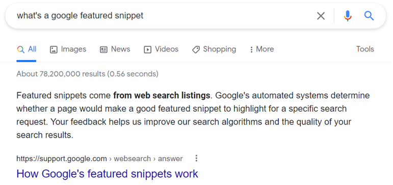
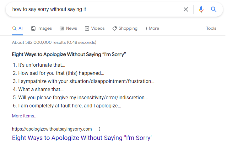
First, let’s be clear on what a Google Featured Snippet is and why it’s so coveted. When you search for something on Google, very often a meaty search result appears at the top of the page.  This is the result that Google feels best answers your query, and it’s presented differently than the other results.  In a featured snippet, the descriptive text (pulled from the website listed) is shown first, and then the website is displayed underneath.  Like so…

A screen shot of the search results for "what is a google featured snippet."


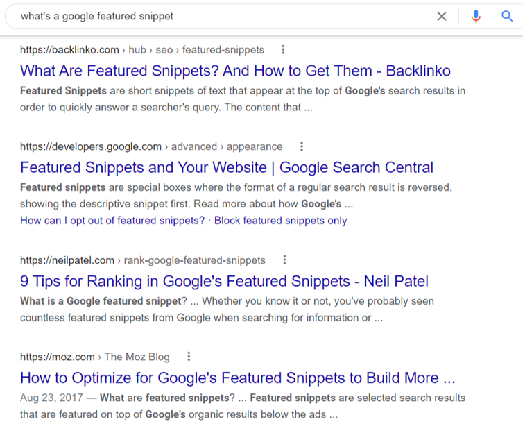
Here are the rest of the first page search results for that query.  See the difference?  The descriptive text is more like a short teaser, and it comes after the website link.


A screen shot of the bottom of the first page of the search results for "what is a google featured snippet?"


You can see why being the Google Featured Snippet is attractive.  You’re at the tippy top of the very first page of search results and therefore, likely to get the most traffic for that particular query.

And while there are things you can do to increase your chances of scoring the featured snippet spot, it’s basically up to Google’s algorithm to bestow the honor.  It uses historical data and patterns to determine which website page gives the best quality answer that most thoroughly satisfies user intent for that particular query.  This means that Google pays incredibly close attention to what people are searching for and which websites are delivering the most effective answers.

As it turns out, there are a helluva lotta sorry people in this world.  And they’re all searching for the best way to apologize for their actions.

In 2011, we wrote a blog post entitled “Eight Ways to Apologize Without Saying I’m Sorry.”  It was meant to help tourism and hospitality folks respond gracefully to situations that required an apology.  Unhappy guests, frustrated tourists, disappointed meeting planners…all are potential apology candidates in the world of hotels, tourism, and hospitality.  The blog post gave clear, practical phrasing and positioning to apologize without using those two little words:  I*m s***y.  (Yes, we’re wary of even spelling them out here for fear of Google finding us again for this topic.)

The advice shared in the post was apparently REALLY effective, but not just for tourism professionals.  Adulterers who got caught, best friends who had a fight, teens trying to avoid parental punishment… all found their way to our informative blog post.

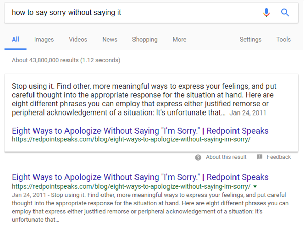
Shockingly fast after the post went live, this happened:

A screen shot of the google search results for "how to say sorry without saying it" from 2011.


It was exciting at first because traffic to our site started to steadily increase.  Actually, we’re not exaggerating if we use the term “skyrocket” here.  We were the featured snippet for many different iterations of that query and our little ol’ company beat out some heavy media hitters.  Forbes, Fast Company, Inc., Reader’s Digest, even Oprah… over time, all had articles on the exact same topic.  All were relegated to the space beneath Redpoint on the search results pages.

And that’s where the problem started.

In time, our website’s bounce rate ALSO started to steadily increase.  Bounce rate measures the number of visitors who leave after viewing just one page on your site.  That makes it a critical metric for your website’s overall health.  (FYI, you can learn more about it here.)

Soon, the overwhelming volume of traffic drove our bounce rate into the high 90’s.  This basically meant that – say – 98% of the people who came to our site left after just looking at that one page.

This doesn’t mean a lot of other relevant tourism industry professionals weren’t visiting our site.  It just meant that there were SO many people wanting to apologize for things like cheating on their spouse that they dominated the percentage of total site visits.  And there was no reason for those folks to visit other pages of our site after getting their apology lesson.  Let’s be real:  the dude who searched for “how to say I’m sorry without saying sorry to my wife for sleeping with her best friend” has no need for a tourism PR and marketing agency.  A crisis publicist, maybe.  But certainly not Redpoint.

So what happened?  In time, Google’s algorithms were trained to see our site as a place people go for a lesson in apologies… NOT as the website of a tourism PR and marketing agency.  This meant we ranked way lower in search results for topics we WANTED to rank for, which are topics relevant to the tourism industry and the services we provide.  And there was absolutely nothing we could do to rebalance the organic search scales.  The power of that post – and our lack of control in being Google’s Featured Snippet – was just too damn strong.

So, we steeled our spines and cut the cord.  The day we took down that blog post was a giant leap toward nursing our inadvertently-bruised website back to health.  But I’m not gonna lie…I indulged in lots of comfort food that day.  I knew it was going to be bittersweet looking at our Google Analytics reports from that day forward.  Bitter, because the traffic numbers would be a tiny sliver of what they had been, which is depressing.  But sweet, because the visitors would likely all be relevant, which is immensely satisfying.

I’m happy to report that our bounce rate is healthy these days and I’m no longer aware of what outrageous evils people are searching for on Google that require an apology.

However, in a hilarious side note, we didn’t delete the post entirely.  We simply moved the content to a new domain we purchased just for the occasion.  And guess what happened within two months?


A screen shot of the first page of search results showing the google featured snippet for "how to say sorry without saying it."


For goodness sake…we didn’t even make the website pretty!  Just slapped the content up there to sit on a shelf until we could decide what to do with it someday.  And it’s still dominating over all the big media outlets as the Google Featured Snippet.

Hmmmm.  Do I see a new stream of ad revenue in our future?  Your move, 1-800-FLOWERS.

Moral of the story?  If you’re a tourism business and you decide to blog about a common human problem – say, a hotel instructs on how to fold a fitted sheet? – don’t break out the champagne (yet) if you become the Google Featured Snippet for the topic.  And start watching your bounce rate like a hawk!

Here’s a smart idea for tourism content creation.

August 12, 2021

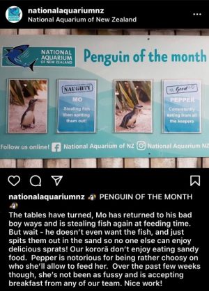
Recently, I came across the National Aquarium of New Zealand’s Instagram page and thought:  now there’s a smart idea for content creation in tourism.  Their “Penguin of the Month” feature awards both a “naughty” and “good” category.  The award post captions are hilariously descriptive and draw the audience into the ongoing competition.  I even admit to being disappointed this month when little Mo reclaimed the Naughty award after finally winning the Good award a few months ago.

Smart tourism content creation idea, showing National Aquarium of NZ's Penguin of the Month Award.

The beauty of this concept isn’t just leveraging the cuteness of penguins.  It’s the fact that they’ve established an interesting, personal, and sustainable stream of content that eases the burden of content creation.

The most frequent complaint we hear from marketers who are responsible for feeding multiple social and marketing channels weekly is this:  it’s a pain in the a** to figure out what to post all the time.  This is especially true if content creation is only a sliver of the person’s job.  Coming up with ideas for engaging content takes time and mental bandwidth.  And if you’re a tourism marketer who wears many hats, you know those two things are always in short supply.  This is why concepts like Throwback Thursday were born, because it’s an easy reach for a weekly content idea.  (BTW, don’t ever use the hashtag #tbt.  Here’s why.)

It’s always smart to find marketing ideas in the wild and use them to spark new ideas tailored to your own unique situation.  You can get more specific help on how to do that here, but for now, let’s talk about the “of the month” type of content feature.

Obviously, if you’re a zoo, aquarium, or any type of animal farm/sanctuary, this idea is ideal for you.  It doesn’t matter if other attractions are doing it too… it’s not a mutually exclusive marketing concept.  Your “of the month” feature is tailored to your animals, your attraction, and your audiences.

But what if you don’t have cute animals in your content toolbox?  You can still tap the “of the month” magic with an interesting, personal, and sustainable stream of content that makes sense for YOU. It doesn’t matter if you’re a hotel, destination, tour company, restaurant, cruise line, or whatever.  People generally like to be entertained by tourism and hospitality content.  This means you’ve got a blank canvas to craft an engaging concept that works for your business.  For example, you could do fun, funny, and/or tongue-in-cheek versions of…

  • Quirky Object of the Month Award, for which you tell a fun story about an interesting knick knack, piece of furniture, piece of artwork, weird utensil, or whatever else is on your property.  Don’t just describe it…give it personality.  “This pitcher shaped like a rooster is a fan favorite here at the inn.  It was originally used to hold milk at the family’s breakfast table, but now we often use it to hold sangria at our Friday happy hours.  Hmmm.  Maybe that’s why it’s a fan favorite?”
  • View of the Month Award, which could take many forms.  Shots from inside hotel rooms looking out, cool/breathtaking views in your area, secret viewing spots only locals know, etc.  Again…captions shouldn’t be boring here, like “isn’t it breathtaking?”  Rather, add flair, like a recurring theme of “if this view could talk, it would say…” and each time answer it with something that grabs attention.  Like, it would say “…why didn’t you bring a picnic?”  Or “…sell your house, pack your belongings, and just move here already.”  Or “…would you like a side of wine with this?”
  • Activity of the Month Award, which could cover anything from physical/exercise activities (i.e. hiking) to seasonal activities (i.e. berry picking) to “only in your area” activities (i.e. oyster shucking down at the local marina) to quirky/random activities (i.e. instructions for proper stretching after a long car trip).

The categories are endless and would be all the more engaging if they’re unexpected.  A city destination might do a “Parking Spot of the Month” feature, and use it to highlight a cool block of shops in various neighborhoods.  A hotel might do a “Guest of the Month” feature, but it’s all about the dogs, cats, and other pets that visit…not people.  A cruise line might do a “Towel Animal of the Month” feature, and make up a story behind each animal as if it were a live being.

The point is…an interesting, personal, and sustainable “of the month” feature is an excellent way to ease some of the burden marketers face in generating content.

And WATCH THIS SPACE to see if little Mo the penguin ever makes it back to the “Good” list.

Three tips for creating engaging virtual tourism experiences.

May 25, 2021

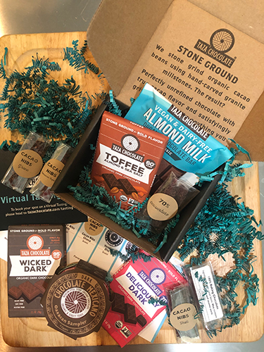
An opened box of Taza Chocolates shows items available in the virtual tasting kit, including bars, discs, nibs, and pouches. These help provide an engaging virtual tourism experience for participants.

As the pandemic fades and travel resurges, you may be wondering…will virtual travel experiences stay relevant?  The answer is YES, and if you’re a tourism provider, here’s the number one reason why you should continue to invest in creating engaging virtual tourism experiences:

They’re a highly effective marketing tool.

Virtual tourism experiences can play a key role in the trip planning process for consumers.  If done right, they can lure people into your sales funnel, upsell services and amenities, and – a critical benefit – provide rich, engaging texture for your various content channels.

Moreover, the pandemic has made people really comfy with online interaction in all aspects of life, business and personal.  This means a turnkey, willing audience now exists…whereas before the pandemic, virtual experiences were much less of a mainstream opportunity.

“Virtual tours” have been around for a while, but largely in the form of online 360° tours and pre-recorded videos.  These can also be helpful marketing tools in a tourism provider’s toolbox… but nothing beats live interaction for making strong connections with guests.

The pandemic has catapulted such virtual, interactive experiences onto a global stage and into the norm. It’s not that they didn’t exist before.  It’s just that the labor and budget resources required to do them justice felt like a heavy lift for a possibly elusive audience.  Now, all that has changed.

If you’re seeking to up your game (or get started) in the virtual tourism arena, here are three tips to help you create effective, engaging virtual tourism experiences that are both memorable and shareworthy:

1.  Include live human interaction.  A live host can create the kind of dynamic experience essential to establishing bonds with guests.  And let’s face it…this gives guests as close to an in-person experience as possible without leaving their computer.  Participants can ask questions – vocally or in a chat function – and converse/interact with the host in various ways as the experience unfolds.  The most effective hosts are vibrant, charismatic storytellers who are quick on their feet and extensively knowledgeable about the subject at hand.  One of the greatest examples of this online right now is WildEarth.tv.  These daily live safaris do an extraordinary job of broadcasting with guides in multiple locations to ensure viewers can always go where the action is.  And the more you watch, the more you get to know (and love) the guides.  They are passionate, funny, experienced, and inspiring.

2.  Optimize real-life elements for virtual settings.  Nothing sabotages a virtual tour like being reminded it’s not as good as the real-life experience.  You never want your host to be forced to say things like “if you were here, you’d be able to see…” or “you can’t see it that well through your screen, but…” or “when we do this in person, we…” A virtual experience shouldn’t be a substandard, repurposed version of your real-life ones.  Even if it’s based on an experience you offer in real life, it needs to be built from the ground up AS a virtual experience.  Also, your hosts should be fully trained on the virtual technology being used (or else you have an experienced crew running point).  And further, they should be specially trained on how to deliver this experience virtually, especially if it’s one they’re used to hosting in person.  Organic, stone-ground chocolatier Taza does a spectacular job of this with their factory-tour-turned-virtual-tasting. Sign up for one to get some inspiration…plus get a delicious virtual tasting kit (pictured above).

3.  Create visual assets that enhance (and guarantee) effective content delivery.  Virtual experiences can’t rely on the rich immersion of real life, nor the chemistry that emerges organically when groups are brought together.  People sitting at a screen need substantive visual interaction to keep them engaged.  It complements the host’s vocal delivery, punctuates the session with visual texture, and underscores memorable moments within the experience. Further, it helps blend education and entertainment, which is one of the best ways to forge connections.  These folks – Airbnb hosts Lucie & David – created an absolutely brilliant online tourism experience taking people on a walking tour of Prague, Czech Republic that follows in the footsteps of a 17th century plague doctor.  The Redpoint gang took this tour together and afterward, every single one of us said “I want to go to Prague.”

All types of tourism and hospitality providers – hotels, resorts, inns, attractions, DMOs, restaurants, cruise lines, tour companies and more – can do this…and continue to do it as part of their marketing efforts.  Tour the area, do interactive kids programs, host cooking demos with chefs, tour grounds and gardens, meet and greet with local businesses, explore nooks and crannies of a lodging property… whatever.  Think of things your guests could experience and bring that to life virtually.

Does this require more logistics and is it more labor intensive than just producing a pre-recorded experience to slap up on your website?  Yep.  But the live, interactive experiences can be more powerful, more shareworthy, and more effective at generating conversions than a recorded video.

Think you don’t have time to do all this?  You do.  Read why here:  Marketing…It’s About Time.

And as a parting gift:  here’s some inspiration to help you in creating and cultivating your own engaging virtual tourism experiences:

Footprints of London does a beautiful job of presenting a blended calendar of in-person and virtual tours, showing how these can sit side-by-side and complement each other.

And the incomparable Laura Begley Bloom created this stellar list for Forbes of some of the best virtual tourism experiences available today

Three major changes coming to digital marketing.

April 20, 2021

There are three major changes coming to digital marketing in the next nine months and marketers are rightfully wary.  Actually…scratch that.  Most digital marketers are actually freaking out and scrambling for solutions, and it turns out there’s no easy fix.  All three changes will in some way dramatically upheave habits and strategies that digital marketers have relied on for ages.  And more importantly, they will negatively impact marketing results…from conversion data and targeting options to website speed and search engine results page ranking.

Did I just make you freak out too?  Sorry.  But ignoring these three major changes and/or hoping they don’t apply to you is not a smart move.  Ignorance may be bliss, but when your sales tank…believe me, you’ll be feeling anything but blissful.

Here’s a clear overview of what’s coming.  It’s not EVERYTHING, but it covers the critical highlights and offers links to more in-depth information about each one.  It should be enough for you to check in with your webmasters and marketing folks to be sure you’ve got a plan to address them.

iOS 14 Update – Coming Spring 2021

Biggest headline:  At some point soon (likely with the iOS 14.5 update, and likely the week of April 26), iOS will require all third-party apps to offer an opt-in prompt (see above image) that allows users to choose whether or not they agree to being tracked.  Also, the conversion tracking window is dropping from 28-days to 7-days, which will make your conversion metrics grossly inaccurate.  Hotel decision-to-book processes are not often contained within seven days.

Impact on your marketing:  This impacts Facebook, Instagram, LinkedIn and more.  Facebook is the biggest worry, especially if you’re using the Facebook pixel or doing any type of targeting or retargeting that relies on tracking in some way.  The wide swath of iOS (iPhone) users who opt out of tracking will now be an unreachable audience for tailored marketing.  This will reduce your advanced targeting options, as hyper-personalization and targeting lookalike audiences won’t be possible.

The iOS update will also result in inaccurate conversion data.  A large portion of your audience will now be untrackable, both because of the opt-out AND reduced conversion tracking window.  Note:  you likely won’t see the impact as instantly as flipping a light switch.  People update their settings on their own time – many take months before doing it – so expect this to feel like a quick slap and then a slow burn of increasing opt-outs over time.

Learn more here:


Google Page Experience Update/Core Web Vitals – coming Summer 2021

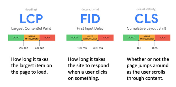
Biggest headline:  Page speed, which measures how fast your website loads and is ready for interaction when a user first tries to access it, will play an even greater role in a website’s Google search engine ranking.  A new suite of metrics called Core Web Vitals (CWV) will measure the elements of your site that are impacting its speed (see the three CWVs in the image above).  If things are out of whack, the report on your Google Search Console (also available at PageSpeed Insights) will tell you precisely what needs to be fixed in order to pass the CWV assessment.

Impact on your marketing:  Google plans a staggered rollout of this update starting mid-June 2021, with full completion by the end of August.  This is important, and you absolutely should correct any issues that are causing your site to fail a CWV assessment.

However, if you don’t have this done by June 15, the world won’t end.  Page speed is definitely a prominent factor in how Google ranks your website (because page speed impacts user experience, which is of top concern to Google), but it’s still just ONE of many factors used to determine that ranking.  Your site won’t get buried instantly because of a CWV fail.  In fact, Google has made it clear that relevant content still beats page speed in terms of ranking.  So even if your CWV are subpar, if you have excellent, interesting, unique, and effective content for searchers, your website can still rank high in search results.

However… do pay attention to your CWV because Google makes it crystal clear what you need to fix if you don’t pass.  Why allow fixable items to drag your page speed down?  Pro tip ->  check your CWV after you do any major content update to be sure nothing uploaded knocked your CWV out of whack.

Learn more here:


Cookies Changing to FLoC on Google Chrome – coming 2022

Biggest headline:  In 2022, Google Chrome will no longer allow websites to use third-party cookies, and it intends to replace them with a new approach called Federated Learning of Cohorts (FLoC).  This means you’ll be able to track individuals ONLY while they’re on your own website.  When they leave and go elsewhere, you can’t follow them around and lure them back with retargeting ads.  Instead, you’ll be able to target “cohorts,” which are interest-based groups (sorted as such by Chrome) sufficiently large enough to maintain individual anonymity.

Impact on your marketing:  If you’re doing any sort of tracking and retargeting on Google, this will impact you greatly.  Google hasn’t released any information yet on how FLoC will work.  We don’t know what advertising tools will be available, nor or any specific details that would help you gear up for the tactical change.  But at the very least, this is going to force you to learn new methods/tools, upheave your conversion patterns, and disrupt formerly reliable marketing channels.

Google says its preliminary trial data shows that using cohorts leads to similar results and advertisers can expect to see at least 95% of the conversions per dollar spent when compared to cookie-based advertising.  But so far, they’ve shown no proof and leading digital marketing authorities are rightfully skeptical.  So basically…we don’t know much but we know it’s coming.

Learn more here:

There’s only one article here because concrete info isn’t available yet, but here’s the most up-to-date overview (at the time of this posting) of what’s going on with FLoC.


OK, that’s a lot to absorb. These three major changes coming to digital marketing are a BIG deal and can be daunting to consider.  So if you need a quick palate cleanser for your brain, check out our past blog posts about the marketing power of biscuits and bunnies.

Why you should care about your website’s bounce rate.

April 7, 2021

Your website’s bounce rate is something you should care deeply about, and here at Redpoint we call it “the sneaky little stat” for two reasons:

  1. It’s one single metric that gives clues to a ton of things that could be out of whack on your website.
  2. Google doesn’t actually LOOK at your bounce rate, yet it’s a supremely important factor in your search ranking potential.  (note: for brevity, I’m just saying “Google” instead of “Google and other search engines,” but this blog post applies to all of them.)

First, what’s a bounce rate?  It’s the percentage of visitors who come to your site and leave after visiting just one page with no interactions.  So, if your bounce rate is 87%, that means 87% of the people who came to your site basically opened the door, peeked their head inside, and then turned around and left <sound of door slamming>.  This ain’t good, folks.  In this example, 87% of the people you lured to your door (and you probably spent some marketing dollars to get them there) weren’t interested enough to come inside your house and get to know you better.

Acceptable bounce rates can vary by industry, type of business, and purpose of website, but here are some general benchmarks to help measure yours:

  • 26-40%:  Excellent
  • 41-55%:  Average, with potential
  • 56-70%:  Definitely room to improve
  • 71%+:  Something’s wrong, fix it pronto

But why should you care about your website’s bounce rate if Google doesn’t actually look at it?  Because your bounce rate is influenced by many critical factors, and those factors are things Google DOES care about…a LOT.  Here are a few important things that can negatively impact your bounce rate:

  • How fast the pages of your website load.  We’ve all been peeved by websites that take sooooo long to load that we leave before the first page even finishes loading.  Google uses site speed among its ranking factors…it likes websites to be fast.
  • The amount of time people spend on your site.  There’s no magic number (i.e. 5 minutes) that Google wants you to hit.  But in the simplest of terms, Google sees people staying on your site longer as an indication that your website delivers a satisfactory experience for users.  And Google’s entire goal is to return relevant and satisfactory results when people are searching.  So let’s say a lot of people searching for “charming country inns that allow pets” spend a lot of time on your site after they click through on the search engine results page.  Ultimately Google will say “hey, this website is a really good match for people searching for that topic, so we’re going to keep showing it higher in the search results.”  So on the flip side, if people searching for that topic get to your site and leave after just one page…Google will see that as a sign your website is NOT a satisfactory match for that topic and will NOT rank you higher (or ultimately, at all) in those search results.  And if you’re a charming country inn that allows pets, this is a bummer.
  • Content irrelevant to your main purpose.  Let’s say you’re a hotel that does a blog post with advice from your housekeeper about how to properly fold a fitted sheet.  It’s a common task that stumps many folks, so it’s likely people will search for it and find your post.  But if all those folks want is folding instructions, and you don’t put anything in the post to seduce them to click through to other areas of your site, they’ll probably leave after just looking at that post.

And of course, broken links, pages with missing data or incomplete text, or anything else that’s frustrating or annoying to users will negatively impact your bounce rate.  Nothing makes a visitor want to leave faster than trying to click (repeatedly, and with great irrational force) on broken links.

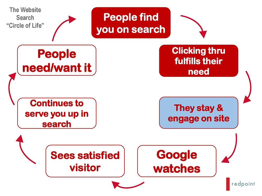
Here’s a handy visual that shows the whole “circle of life” for the website experience, with “they stay & engage” as the part where bounce rate would enter the equation.  If they do indeed stay and engage, it keeps the circle of life intact.  But if they leave at that juncture, it breaks the circle.

diagram showing the path visitors take from search engine result through to your website, and how the "stay and engage" moment determines bounce rate

Your bounce rate is easily found in Google Analytics, and if you discover it’s too high, here’s a practical guide for ways to reduce it.

And now that you know bounce rate is so important to your Google ranking… wait ‘til you see how alt text impacts it.

Your new year’s resolution? Better alt text.

January 13, 2021

OK, so this may not be the sexiest or most popular new year’s resolution, but here’s why it should make your list.

First, let’s be sure you understand what it is.  We’ve found through our consulting and digital marketing work that very few people DO understand it, even those that are responsible for writing the alt text on their own brand’s website.

Alt text – short for alternative text – is the text description applied to images on websites (and social media, but that explanation is for another day).  This isn’t the same as a caption, which can appear on your website with the image so that anyone can instantly see the words.  The alt text is hidden from the front-facing website and doesn’t appear unless it’s needed.  Think of it like writing a description on the back of a real-life photo that’s sitting in a frame.  When you look at the photo you can’t see the description, but if those details are needed, you can get them.

Now… when would such additional hidden details be needed?  Because if you’re looking at the photo on a website, you can clearly see what that photo is about… right?  Nope.  Not always.

The hidden text is vital in these three ways (all equally important):

  1. It gives search engines a full description of the photo, which makes it easier for search engine algorithms to see and understand images.  Using alt text on your website images means that a search engine can more easily find your photos and then show your website and/or images to people searching for relevant things you offer.
  2. When images on websites don’t load properly – when there are connectivity and/or internet strength issues, for example – the alt text will appear instead, so at least visitors know what you were trying to show.
  3. For those with vision impairment issues, or those who use screen readers for any other reason, the alt text is essential because it describes photos that the user physically CANNOT see.  A screen reader, if you didn’t know, is a program that reads content on a webpage aloud, and the alt text allows the screen reader to give information about the visual aspects of the page.  And by the way, ADA Compliance actually requires this of websites, so you might as well do it right.

Now, why won’t a caption suffice for all this?  Technical aspects aside (and there are some), the biggest reason is because a caption isn’t necessarily a proper description of a photo.  For example, here’s me trying to decide between my top two vices (since we’re talking about resolutions and all):

Chris Miranda holds prosecco bottle and coffee cup while deciding which to drink while giving a webinar.

The caption for this photo might be:  Chris decides between two vices.  But the alt text would be something like:  Chris Miranda holds prosecco bottle and coffee cup while trying to decide which one to drink while hosting a webinar.

So that takes us back to your new year’s resolution about committing to better alt text.  When you’re ready to dive in, here are nine brief but helpful tips for writing effective alt text.

And you can drink prosecco OR coffee while you read that article… no judgement here.

Looking for other ways to make your website easier to read and more accessible?  Choose your font and typeface wisely.

Words matter, but so does the font you choose.

November 5, 2020

A graphic of the word typeface using a magnifying glass.If you’re not a graphic designer or branding specialist, your experience with choosing typefaces is likely limited to the little dropdown box at the top of your screen, where you select from fonts like Arial, Universal, Comic Sans, and the whimsically-named Wingdings.  You may not even realize that a typeface is a design of lettering (i.e. sans serif), and fonts are variations within each particular typeface (i.e. Arial or Calibri).

Further, you probably choose your font for documents and emails based on your own personal preference of what you think “looks good.”  Is it pretty?  Professional?  Strong?  Does it reflect your personality?  Does it set you apart?  Or is it just the default font used by Word, Outlook, etc. and you never give it a second thought?

But in marketing and branding…typeface and font matter A LOT, and they can’t simply be based on your personal preferences.  Therefore, it requires a bit of knowledge to make wise choices.  Why?

First, because accessibility and legibility are essential in marketing, and not just because laws and the ADA say so.  There’s a large group of folks out there with poor vision, learning disabilities, and reading/comprehension issues, and you’re ignoring that entire audience if they don’t have access and the ability to comprehend your messages.

But second – and as importantly – the world is full of clutter and speed, which has reduced people’s attention spans to mere milliseconds.  Why would you risk wasting a precious point of contact using a typeface or font that’s even a tiny bit difficult to decipher?  You’ll lose ‘em, fast.

So here are eight super-smart tips for choosing your typeface and fonts wisely when designing your logo, brand identity, website and more.  This articulate gent Gareth Ford Williams succinctly details – in an easy 10-minute read – what you should consider.  And if psychology bores you, just skip right to the list of eight things you need to know:

A Guide to Understanding What Makes a Typeface Accessible

I guarantee after reading this, at the very least, you’ll forever beware of the mischief that “imposter letter shapes” cause.  Sneaky little buggers.

Got your typeface and font all sorted?  Now try these Four Quick Tips to Strengthen Your Writing.