The worst opening line for an email.

September 19, 2024

A side view of a black and brown dachshund dog looking sideways at the viewer. The text reads "Do you REALLY hope I'm well," which is the worst opening line for an email.
 

Let’s cut right to the chase: “I hope you are well” is by far the worst opening line for an email. Or a letter. Or a LinkedIn message. Or any really any kind of communication, but especially when you’re trying to get the reader’s attention for something important to you…a sale, a deadline, a call to action, and so on.

Here’s why, and here’s what to use instead.

WHY IT’S BAD

It is – by a landslide – the most commonly used opening line in communications. That means people see it so often, they’re desensitized to it. It’s become a trite, meaningless phrase.

And worse than that, because it’s so overused, it feels disingenuous to the reader. Like…does the sales rep hawking event space or the colleague asking for your input on a report REALLY hope you are well? In truth, it’s likely they haven’t given much thought your well-being. Rather, they have something they need to tell you or get from you. You know it. They know it. Hence, disingenuous.

Here’s why this is a problem: humans have tiny attention spans. We are distracted, we multitask, and (thanks to technology) we get bombarded with way more communication than we can handle.

What gets our attention? When something is DIFFERENT.

So if you want someone to pay attention to the message you’re sending – engage with it, feel something, do something, or even just read the damn thing – why start the communication with a boring sentence that’s predisposed to make their eyes glaze over?

This is especially true for folks who work in marketing, sales, public relations, and journalism. You should never bait your hook with a forgettable line like “I hope you are well.”

WHY WE USE IT SO OFTEN

It’s like a way for writers to warm up before writing. You sit down to your computer and you don’t quite know how to start your message, so you type out that nice, generic opening line to get your brain started. Then you can segue into writing the REAL part of the message.

It’s akin to warm-ups for athletes before a competition or singers before a show.

The thing is…warm-ups are boring to watch.  Just like they’re boring to read. They should be done behind the scenes and be invisible to the audience.

But writers, just like readers, are distracted, multitask, and have tiny human attention spans. So when we sit down to write something, we just want to GET IT DONE. Sitting there, staring at the screen trying to think what to write? That feels like wasting time. We get antsy. We get impatient.

So we fire off some version of “I hope you are well” and it gives our brain that dopamine hit that says, “I’m not wasting time, I’m actually writing something.”

Rinse and repeat this pattern often enough and soon it becomes a mindless habit. And voila: the worst opening line for an email becomes your comfortable go-to.

WHAT TO USE INSTEAD

Oh… you wanted a one-size-fits-all answer? Alas, effective writing doesn’t come from a cookie cutter.

You can still have your warm-up. Just make it “thinking time” instead of an empty phrase irrelevant to your purpose. Indeed, the best result will come when you craft an opening line tailored to the relevance of your message. Some examples that have crossed my inbox:

  • From a job seeker: When I read your job posting, it stopped me in my tracks and made me instantly want to apply.
  • From an industry colleague: Your website sent me down a rabbit hole of joyfulness.
  • From a realtor: NYC real estate is a blood sport.

Yes, it takes a little longer to come up with an opening line that stands out from the sea of sameness. But isn’t it worth it if it grabs your reader’s attention? If they engage with your opening line, they’ll be more likely to keep reading. And if the opening line is related to your core message, you’re wisely priming the pump.

Still not convinced? I’ve got two words for you: PREVIEW PANE. In email, LinkedIn messaging, and most forms of electronic communication, the recipient’s inbox is often set up so they can see a preview of the message before opening it. DO YOU REALLY WANT THAT PREVIEW TO BE “I HOPE YOU ARE WELL?” Ugh, it’s a waste of coveted, influential space that tortures my little marketing heart.

Listen, if you are in a massive hurry and absolutely have to “show” your warm up to your audience, at least make it different than the overused “I hope you are well.”  You can try either of these:

  • Happy (day of the week)! You could also use the month instead, if it’s the start of a new month.
  • Hello from (location)! This is useful if your recipient is far away (“Hello from NYC” to someone in Georgia) or even in a different part of your building (“Hello from the 4th Floor!”).

But if you want to break the habit of using the worst opening line for an email, these additional resources will help:

Here’s how to stop being an impatient writer.

The power of 15 minutes in writing.

Five opening lines that sabotage your email’s success.

Just remember…you may indeed care about your recipient and hope they are well. Just do it at the closing. 😉

PS: don’t even get me started on email subject lines.


How to sell your least desirable tourism product.

April 17, 2024

Nearly every hospitality business faces this challenge:  how do you sell your least desirable tourism product? The smallest hotel room. The worst table in the restaurant. The windowless meeting room.  Marketing folks NEVER put those in the spotlight for sale.  In fact, they do their best to hide them.

But there’s untapped potential within those “flawed” products…and I don’t just mean by selling them at a discounted rate.  With a little branding polish, they could become marketable AND generate more robust revenue streams.

The trick is…lean into the flaws.  Don’t try to hide them.  Make the flaws the sales hook.

That sound bonkers to you?  It’s not, and here’s why.

WHO SELLS FLAWED PRODUCTS SUCCESSFULLY?

While the tourism industry isn’t fully adept at this yet – see below for tips – other industries are raking in the dough from selling their least desirable products.  For example:

The diamond industry has “rebranded” flawed diamonds – those with a lot of inclusions, which are imperfections that look like chips, marks, and bubbles – as Salt & Pepper Diamonds.  Instead of relegating flawed diamonds to the worthless pile, they virtually champion them. Marketing for these gems includes language like…

  • These captivating inclusion patterns resemble tiny salt and pepper specks scattered throughout the stone, ensuring that no two are alike and making your stone unique.
  • Salt and pepper diamonds symbolize the “wild child”…they’re fun and their flaws work to benefit the overall appearance of the gem.
  • Their quirky look helps couples match their unique love story with a similarly unique diamond, turning their “flaws” into their biggest asset.

In the handblown glass industry, uniformity can’t be guaranteed but there’s a certain standard of quality that must be maintained to make products “sellable.”  Luxury brand Simon Pearce does a masterful job at marketing the glassware products that don’t *quite* meet that standard but are still perfectly usable products.  Sold under the collection heading “Seconds,” the marketing for these products actually celebrates the flaws:

“Unique beauty lives in imperfection. Each Seconds piece captures a moment of the human hand at work, where unique conditions lead to slight variations and differences, preserved in glass… a thoughtful option for those who value character and an organic quality to their household objects.”

And of course, there’s the booming industry of imperfect foods – from produce to packaged goods and everything in between.

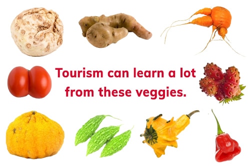
A variety of colorful fruits and vegetables sit on a white background, with each item being slightly deformed, like a twisted carrot, a strawberry with four prongs, and a tomato that looks like two tomatoes smashed together. The copy reads: Tourism can learn a lot from these veggies.

It’s a spectacular win-win that combats food waste. Indeed, there’s a wildly successful brand actually called Imperfect Foods (though they are not alone), and all of their products are considered “substandard” by the businesses that produce them because of:

  • Cosmetic imperfection
  • Contains leftover ends and pieces
  • Size or weight imperfection
  • “Ugly” produce – tastes as expected but looks deformed
  • Made with rescued or upcycled ingredients

And yet… there’s a market for them.  And no one is trying to hide the flaws.  In fact, the flaws ARE the sales hook.

HOW MIGHT THE TOURISM INDUSTRY DO IT?

Generally, the industry sells the least desirable tourism products in one of two ways:

  1. Position it as a “value” item and charge less. This goes for everything from interior cabins on cruise ships to off-season time periods. The marketing focus here is on PRICE.
  2. Provide misdirection by mitigating the perceived flaws with a special benefit. The clever folks in Nova Scotia do this by recasting winter as “lobster season.”  They’re essentially saying sure, it’s freezing cold but this is when lobster is the freshest and most abundant… come up and eat!

Those two options require you to either give a discount OR create circumstances for misdirection.

But that third option – leaning into and marketing the flaws themselves – is underutilized and has great potential.

Consider these ideas:

Brand your “low season” and create excitement for what it is.

Vancouver Island promotes their Storm Season. This is not “come here during Storm Season and we’ve got a lot to keep you busy.”  This is, “come here to experience the storms.”  THAT is a perfect example of leaning into perceived flaws to sell your least desirable tourism product.  Suddenly it’s not so undesirable because there’s a hook.  You may not have awe-inspiring Pacific Coast storms at your location, so you’ll have to figure something else out. What can you highlight during your low season so you can make some noise about it?  Is it Quiet Season, Astronomy Season, Windy Season, Unpredictable Season…hell, even Frostbite Season could have appeal if positioned properly.

Brand your smallest rooms as “Cozy Rooms” or “Tiny Rooms.”

Deliberately PUSH the fact that they’re small. Yes, they can be priced lower than rooms with larger square footage but by branding them, you’re making them more desirable. And you’re also managing expectations up front. You might say that these rooms are a more intimate size, perfect for snuggling up tight with your partner or kiddos. Also, could there be some kind of special perk for folks who book these rooms…one that allows you to sell it at a higher rate?  Does the Cozy Room come with a Cozy Blanket to take home?  Are the walls of the Tiny Room decorated with dozens of tiny paintings?  Do guests of these rooms get a complimentary appetizer or dessert in your restaurant?  The possibilities are endless.

Brand your noisiest rooms as “Night Owl Rooms.”

That room near the service elevator, or the one directly over the ballroom or bar area?  You know… the one you get the most noise complaints about?  How about you call it what it is and promote it as a room for folks who don’t like to go to bed early?  This also manages guest expectations and will preempt many complaints. You might also offer a perk here to be able to charge a higher rate – complimentary movies/streaming after 11pm, minibar credit, special late night snack basket.

Brand your worst restaurant table as “The Family Table.”

Or call it whatever name you want – like if your restaurant name is Tom’s Bistro, call it “Tom’s Table” or “The Bistro Table.”  The point is position it so that anyone who sits there is like part of the family.  This is usually the table right near the kitchen doors and so lacks ambiance… but what if instead, you lean into how it’s closest to the action?  Maybe guests at this table get a “whim of the chef” appetizer or amuse bouche that’s not served to the rest of the tables. Maybe someone from the kitchen comes out to chat with them for a few minutes. Like the kind of thing that would happen if the guest really WAS family. And suddenly…presto, you’ve got a marketing hook and you might even generate a waiting list for that table.

Brand your hard-to-find, windowless meeting room as “The Seclusion Room.”

There’s something mischievous about the idea of positioning such a room as a place where secrets can be discussed safely. A place where you won’t be disturbed or distracted. A place where groups can be sequestered for deep thinking, creative brainstorming, and concentrated strategic planning.  You can have a little fun with this – playful do-not-disturb signs for the door, have special complimentary amenities available for this room (doodle paper and crayons anyone?), and offer upsells in keeping with the theme like a Seclusion Station with snacks/drinks that makes the meeting self-sufficient. It’s important to note that ANY meeting can book the Seclusion Room – they don’t need to be discussing secrets – but the branding has given the room a personality, and now it seems more desirable.

Got a challenge you don’t see here and want an idea?  Drop me a line and I’m sure I’ll think of something. 😉

Most importantly, if you’re going to take an approach like these to sell your least desirable tourism product, you really need to lean into it fully.  That means:

  • Promoting it on your website with the right language, images, and/or videos.
  • Describing it with the right positioning in your sales collateral.
  • Ensuring your guest services or sales staff is aware of the positioning and has the right words to sell it.

Need more tips like this?  Here’s how to promote your brand’s weaknesses strategically.

What makes a dramatic tourism marketing photo?

March 16, 2023

Your personal photos serve to capture a scene and a memory, but a marketing photo has another job:  it must persuade and entice.  But before it can even do those things, it has to catch someone’s attention.  That means your marketing photos need to be arresting enough to stop thumbs and stand out among the sea of clutter that barrages people every day.  Which begs the question:

What makes a dramatic tourism marketing photo?

By “dramatic,” I mean it evokes emotion, piques curiosity, and/or makes a bold statement.  This is done through strategic use of angle, lighting, perspective, and subject choice.  A dramatic tourism marketing photo can tell a story in one glance.  And it can also get someone interested enough to stop and read the caption or other accompanying message you want to convey.

In that latter sense, the photo is just a lure.  It’s bait, if you will, that hooks your audience into hearing what you have to say.  So for a photo to hook as many people as possible, that bait needs to be nice and juicy.

A picture can indeed be worth a thousand words.  Here are five dramatic tourism photos I’ve come across in the past month, and what each one says to its audience.

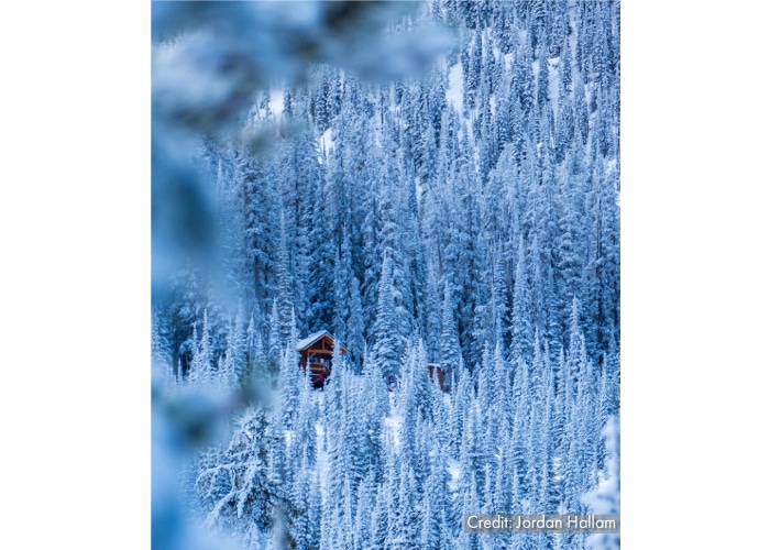
Destination British Columbia

A brown cabin sits amidst a white snow-covered forest, as an example of what makes a dramatic tourism photo.


This says:  private, remote, solitude, peace, quiet.  It also says, “Breathe fresh air in the wilderness and get away from the noise and clutter of your daily life.”

In this sea of snowy bluish-white, your eye is drawn to two things:  1) that little patch of brown, where the cabin sits nestled in the woods, and 2) the blurry branches in the left foreground.  And the rest of the image is just natural, uninhabited, snow-blanketed forest.  In this photo, the perspective distance from the cabin and the upward angle that still allows the cabin to peek through the trees really nail the emotion here. The cabin alone or the blurry branches alone wouldn’t create the same impact.  But they work together to hold the viewer’s attention, and that in turn communicates a message that viewers don’t even realize they’re receiving: this is literally “getting away from it all.”

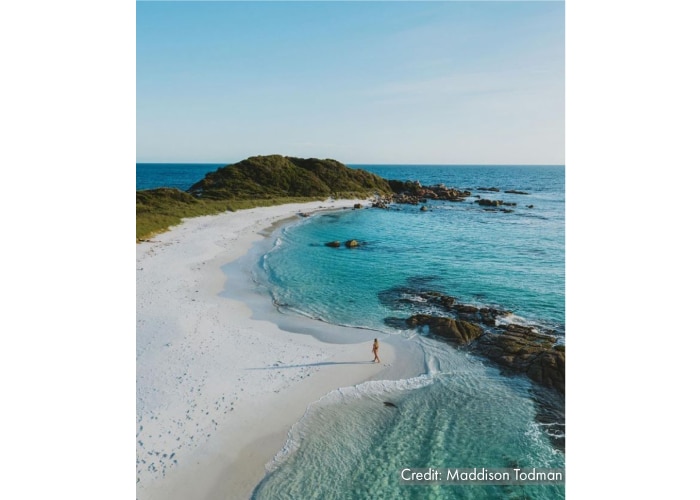
Tourism Tasmania

A woman walks on an uninhabited beach with swirling turquoise water and white sand, as an example of what makes a dramatic tourism marketing photo.


This says:  unhurried, no decisions to make, no responsibilities.  It also says, “Be alone with your thoughts and slow down your speed.”

The curves and swirls that juxtapose white and blue are enough to stop someone’s scrolling thumbs, but then it’s the lone human walking near the water that really makes this photo.  The aerial perspective, coupled with the person, convey the scale and context of the landscape in a way that neither a close up, nor the same photo without the person in it, ever could.  And even though there’s a light frothy surf where the beach meets the shore, the timing of this photo evokes the feeling that everything on this beach is still and calm…and so the only movements are the ones YOU choose to make.  The person in the photo is clearly walking, which is essential to the emotion of the photo.  If the person were standing still, it wouldn’t create that same compelling dynamic.

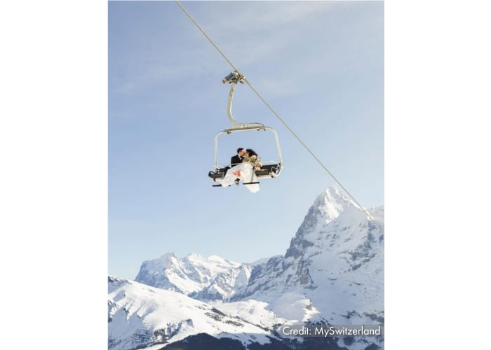
Switzerland Tourism

A bride and groom dressed for a wedding sit high up on a ski lift chair with the white snowy Alps in the background, as an example of what makes a dramatic tourism marketing photo.

This says:  unforgettable, breathtaking, Instagrammable wedding memories.  It also says, “If you’ve got joie de vivre and a fun spirit, we’re the right place for your wedding.”

A quick glance at this photo catches attention because the couple on the ski lift is clearly NOT wearing ski gear.  And the “white space” around that couple ensures that they really pop…it makes a viewer want to stop and zoom in for a closer look.  What helps here is that the background is SO majestic.  It screams “classic Swiss Alps” for a wedding backdrop, and yet the mountains don’t dominate the scene.  Moreover, the perspective looking up from the ground, and the simplicity of what’s captured in the frame, evoke the feeling that the newlyweds are high above and away from everyone… alone together, far removed from anyone and anything.  I mean, could it get any more romantic than that?

Klahoose Wilderness Resort

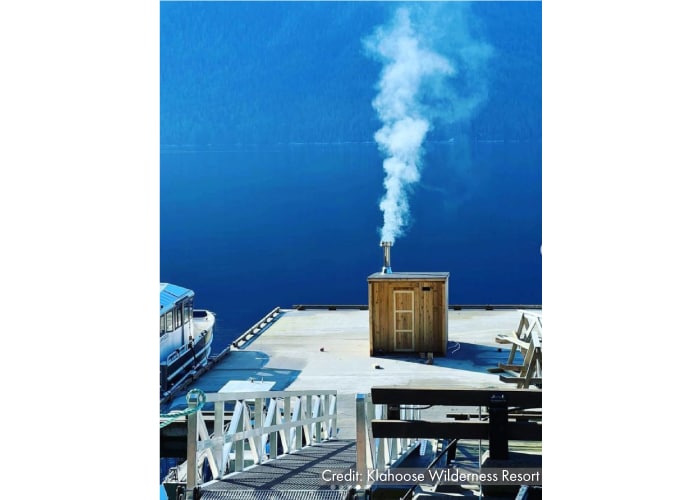
A brown wood shed with a silver pipe on its roof that is billowing steam sits on a doc surrounded by calm blue water, with a ramp leading down to the dock in the foreground. This is an example of what makes a dramatic tourism marketing photo.

This says:  unusual experience.  It also says, “Whatever that is, it looks cool.”

It looks like a shed sitting on a dock, and that might be enough for someone to stop and check it out.  But then, it has steam coming out of the roof, so…what IS that?  It’s the steam that really makes this shot because it piques curiosity.  Then the caption tells you that this is a work-in-progress shot of the resort’s new wood fire cedar sauna and just like that…you want to be in that sauna.  The downward perspective from an elevated viewpoint shows just enough context for the viewer to understand its cool location, and that super calm blue water surrounding it adds to the allure.  BTW, you can see the finished sauna here.

Inn by the Sea

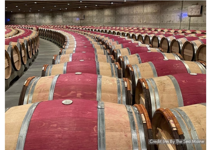
Long rows of burgundy and oak wine barrels stretch as far as the eye can see, giving an example of what makes a dramatic tourism marketing photo.

This says: “You want wine?  We’re not playing around.  We’ve GOT wine.”

Landscape and nature aren’t the only subjects for dramatic tourism marketing photos.  Look at these wine barrels.  The way the rows curve at the back, along with the perfectly aligned strips of oak and burgundy coloring, really nail the drama for this photo.  They draw the eye and give the impression that the barrels continue on to infinity.  And nothing says “we’ve got plenty of wine” like a seemingly unlimited supply of wine barrels.  Even better:  this photo was used to promote inn’s wine pairings and menus for Maine Restaurant Week.  Why is that better?  Because it’s soooo different than the usual photo used to promote such an event, like a glass of wine next to a plated dinner.  This stands out.

What’s the bottom line?  What makes a dramatic tourism marketing photo isn’t necessarily having a dramatic subject.  It’s CREATING a dramatic feeling by choosing how the subject will be photographed.  It may take a little more investment on your part – time, money, expertise – but it’s well worth it to invest in this kind of marketing bait.

For more (undramatic) tourism marketing photography tips, find out the secret to a great tourism photo.

Your belly button is an email marketing tool.

November 9, 2022

Picture of a woman's stomach, with her hands surrounding her belly button, which could be an excellent email marketing tool.

Wait… IS your belly button an email marketing tool?  Damn right it is.  Here’s why.

Consumers kinda suck, don’t they?  They need to be rewarded for everything we want them to do…liking things, sharing things, buying things, answering things.  It’s maddening.

Well marketers, we have no one to blame but ourselves.  We’ve conditioned people to chase carrots and respond to hoopla…which means we’ve ALSO conditioned them to ignore stuff that’s boring, predictable, trite, and unrewarding.  If you add in clutter from other sources, their willingness to focus on your boring stuff drops even lower.

Where does this leave email subject lines?  At the top of your “spend brainpower here” list.

Think about it…all the time and energy you spend creating the perfect email content is 100% useless if people don’t open the email.  And when sifting through their barrage of daily incoming emails, consumers use three main criteria to determine which ones will get their attention:

  1. How much they care about you vs. how much they care about the rest of the senders sitting in their inbox.
  2. How much time they have available when your email arrives.
  3. Is the content going to be worth their time?

And #3 is why subject lines should get your brainpower.  You have little or no control over #1 and #2.  

If your email marketing subject lines are things like “August Newsletter” or “News from…” or even something a little more specific like “Winter Packages at…”… you are relying on the first two criteria (which – again – are beyond your control) to supply the magic “open sesame” of consumer response.

But if your subject line is something like…

Procrastination is fine. (From Pacifica Hotels)

I hate purple. (From Chilewich)

Stick Season – Have You Ever Experienced It? (From West Hill House B&B)

The ecosystem of your belly button. (From American Museum of Natural History)

Hydrangea Heaven at Chatham Bars Inn. (From Chatham Bars Inn)

Because our first shoe had to be perfect. (From Everlane)

Caution:  Do not lick this email.  (From Seamless)

…you’re using the subject line as a lure to snap desensitized recipients to attention.  It’s likely that 80% or more of the emails they receive each day have boring subject lines.  Make yours interesting and you’re one notch closer to seducing them into seeing your email content.

Here’s the best part.  If you pay heed to #3 (teasing interesting content)…and then you actually ensure that the content IS interesting…over time, it’s going to positively impact #1 and #2.  Remember: marketers train consumers.  And the more you train them that your emails are interesting, the more that #1- they will care about you and your messages, and #2- no matter when your email arrives, they will make the time to read it.

It’s a delicious cycle of persuasive marketing goodness.  And soon you will find that consumers – those picky, aloof, what’s-in-it-for-me monsters we marketers have created – will suck just a little bit less.

Tourism folks may not easily be able to use a belly button as an email marketing tool – although for years, we worked for Ripley’s Believe It or Not! Times Square and no body parts were off limits for marketing there – but the concept is the same.  At the end of the day, it’s all about making your marketing more persuasive.  And therefore, making all that precious time you spend creating content…worth it.

Four writing tips to make tourism marketing more persuasive.

January 25, 2022

If you do any form of tourism marketing – destination, hotel, cruise line, attraction, tour company, whatever – you know that your number one job is to inspire the itch to travel.  Further, you want to persuade people to travel to/with YOU.  This job is made infinitely harder by humans’ short attention spans.  You’ve only got a moment (or less) to catch their interest.  Here are four tips for persuasive tourism marketing writing, so you can leverage that precious moment.

Choose meaningful, rich descriptors that tell a story without you having to explain.

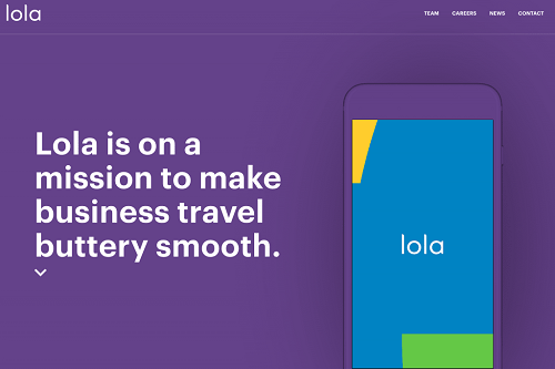
I’ll never forget this ad I saw years ago for the (former) corporate travel booking app Lola:

Ad for travel software Lola that says they help make business travel buttery smooth.

Buttery smooth?  That is the most delightful way of saying “no hassles, no mistakes, no friction, no inefficiency, and no logistical nightmares” I’ve ever seen.  It evokes a silky, luxurious feeling.  As a frequent business traveler, you can be damn sure I want all my trips to be buttery smooth.  Who wouldn’t?

If you choose words that – by their very connotation – help articulate the story you’re trying to tell, you’ll have to use far fewer of them to get your point across.  How do you find these descriptive gems?  It just takes patience and a thesaurus.  It’s worth investing the extra time to select the words that will hook your audience with a powerful image.


Skip the details and capture imagination first with a punchline that resonates.

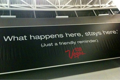
The best example of this has GOT to be the marketing campaign Las Vegas, NV first introduced in 2002:

Billboard in Las Vegas that says what happens here stays here.

That single sentence says: “when you’re here, you can step outside your normal life and go wild, have fun, behave differently, be a little naughty, take a few risks, make outrageous memories, do things your friends and family would never in a million years think you would do.  And then when it’s over, you can go back to your uneventful life and we’ll keep your delicious secret.”  What happens here, stays here. says ALL THAT in just five words.

That “aspirational punchline” writing style works well in tourism marketing.  Many people use travel as a way to reset their lives, shed frustrations, experience new things, and escape tedious daily routines.  Marketing slogans used in campaigns are naturally one way to tap this style…slogans lend themselves well to punchlines.  You’ll never want to leave.  Find yourself here.  Come back new.  Paired with imagery that nods to the underlying story, this type of punchline crisply delivers the benefit you’ll experience with that journey.

But slogans aren’t the only way to leverage the aspirational punchline writing style.  Social media captions are a perfect channel for it.  I remember seeing an Instagram post a few months ago for a quintessential New England inn.  It featured a carousel of charming inn-and-surrounding-area photos…the covered bridge blanketed with fresh snow, the magical twinkling lights at night on Main Street, the horse-drawn sleigh rides, etc.  And the caption simply said:  Vacation in a snow globe.  I hate being cold, and yet suddenly I wanted to buy a pair of cute furry boots and catch snowflakes on my tongue while drinking hot cocoa wrapped in a plaid blanket during a sleigh ride.  But I read that sentence after seeing those photos and I literally pictured myself inside a snow globe.


Use FOMO wisely.

Fear Of Missing Out can be a huge motivator in any purchase decision, but it’s especially useful to writers in hospitality and tourism marketing.  One obvious place for inserting copy that pokes someone’s FOMO nerve is in the booking process.  Seeing that there are “only 5 rooms left” or that “47 people looked at this deal in the past hour” or that “only 2 dates remain at that price” really creates a sense of urgency.  If the person is wrestling with indecision, FOMO can nudge them over the edge.

But the booking process isn’t the only place in the travel decision-making journey where evoking FOMO is a useful writing tool. People will often play out in their minds how they’ll share an experience on social media with friends…BEFORE they’ve even booked the trip.  They picture themselves taking THAT selfie, or THAT food photo, or proving they were on THAT adventure.  Lean into that sometimes.  “Make your friends jealous.”  “We only have 10 cabanas.  Is one of them reserved for you?”  “Instagram was made for this view.”

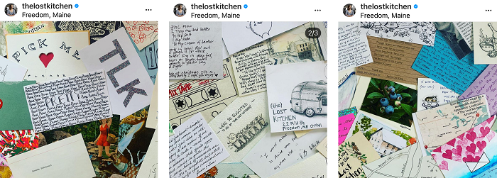
In a more dramatic example, a restaurant in Freedom, ME puts FOMO at the very core of their entire marketing strategy.  The Lost Kitchen is an intimate seasonal restaurant that seats only 48 people per night.  And to snag one of those coveted reservations, you have to enter their annual lottery by sending in a postcard.


Dozens of colorful postcards sent to the Lost Kitchen restaurant requesting reservations.

The restaurant receives more than 20,000 postcards each year for those precious few seats.  Oh, and to know when it’s time to send it, you need to follow their socials and sign up for their newsletter.  FOMO marketing at its finest.  <chef’s kiss>


Pair words with imagery that tells most of the story.

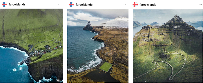
If you look at these images of the Faroe Islands, what comes to mind?

Three dramatic images of the Faroe Islands that show rocky coastline, high cliffs, and rich greenery.


Using such images, they never EVER have to say things like this in their copy:  remote, peaceful, breathtaking, natural landscape, small villages, wide open spaces, the opposite of big city life, undiscovered, fresh air, enviable and memorable vacation photos, not a tourist trap, crashing surf, unspoiled, vast, and dramatic views.  I hate to say it, but they could even simply write “come visit” as the caption for these photos and it would still work.  Words can be powerful and persuasive, yes.  But in tourism, often the visuals do the heavy lifting on persuasion.  That isn’t even the official tourism account of Visit Faroe Islands and I still want to go.

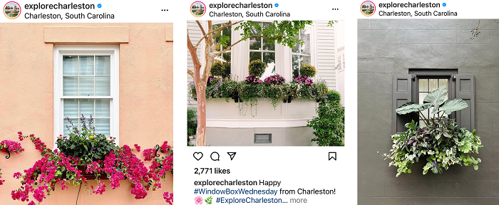
While it’s true that the Faroe Islands has a built-in advantage on the dramatic imagery game, other types of visuals can lift the persuasive burden off words.  In a much less dramatic example, take a peek at Charleston, SC’s Instagram feed.  Every Wednesday brings a photo of a flower-filled window box that can be found hanging outside buildings throughout the city, using essentially the same exact caption: “Happy #WindowBoxWednesday from Charleston!”


Three images of Charleston South Carolina showing colorful, flower-filled window boxes outside homes.

That consistent pairing of photo-and-caption does several things.  It positions Charleston as a charming neighborhood where pleasant strolls can be taken.  It gives the impression that Charleston is awash with flowers at every turn.  It evokes the image of a welcoming and neighborly small town.

There’s something about window boxes that make a place seem more friendly and filled with personality.  A single window box does that for a single house.  So, collectively, hundreds of window boxes achieve that same goal for a destination.  And the copywriting team barely has to write a word about it.

Does it work?  You bet it does.  I’ve been dreaming about planning a trip to Charleston and – after following their Instagram for so long – it actually crossed my mind to try to go when the window boxes are at their most colorful.  And I’m not even a gardening enthusiast!

If you want to up your photography game to give your copy a better assist, see here to learn secrets of a great tourism photo.

And if you’re looking for more inspiration beyond these four writing tips to help make your tourism marketing more persuasive, here’s a handy resource:  Copywriting Examples.  Bless the gent who pulled all those examples together on one website and made all those teachable moments sortable.
The secret to a great tourism photo.

October 26, 2021

Tourism is a highly visual industry.  Photos are a key tool used to tell tourism stories, but there’s a secret behind the great ones that make the biggest impact.  Someone took the time (and often, money) to get it right.

More dramatically put:  someone resisted the temptation to use photos that were easy to get but kind of “meh” in terms of quality.  “Meh” photos serve the functional purpose of photography, but they are completely uninspiring and make no impactful impression on the viewer.  So, yeah…you have photos to put on your website.  Check that box.  But are they seducing site visitors into considering a trip?  That box stays unchecked.

Fear not, there are a whole bunch of “great” and “meh” photo examples down below.  But first…

Sucky (and Silent) Consequences of Using “Meh” Photography

When tourism businesses choose to settle for “meh” photography, it causes much heartbreak.  Throughout my career as a tourism publicist and marketer, I’ve seen:

  • A hotel client who lost a highly-desired Architectural Digest story about their opening launch because their photography wasn’t good enough. (AD wasn’t being snooty…their photography was NOT good enough.)
  • Another hotel client whose online booking conversion rate absolutely sucked…and a website audit revealed that people were leaving the site after looking at the photo gallery. (Tragic, as a photo gallery should inspire people to hit the “book now” button.)
  • A destination client who was included in a syndicated news editorial round-up…and the only one of the eight destinations included without a photo accompanying their blurb because their photo wasn’t “quite right.” (Seven destinations with glorious vibrant photos and only one with just text… which one do you think got overlooked by readers?)

But those are examples where the consequences were traceable and known.  Far more dangerous are the silent consequences of “meh” photography.  No one ever leaves your website unimpressed and without booking…and then calls you up to say, “hey, I was considering a stay at your hotel, but just wanted to let you know that the photos didn’t really sell me on the place so I just left the website without booking.”

So, the bottom line is…you don’t even know how many sales you’re NOT making because your photos are just “meh.”

But trust me.  If they’re “meh,” it’s happening.

Why Is This So Hard?

Why do so many tourism businesses settle for less-than-great photos to use in marketing?  Three common reasons.

  1. They feel it takes too much time and they don’t have the bandwidth to organize/oversee it.
  2. They don’t want to spend the money for a photographer and/or stylist.
  3. They don’t understand the difference in impact between a “good enough” photo and a “great” photo.

It’s a real head-scratcher to me, but I’ve seen clients spend $20-$30 million building a gorgeous hotel, and then fight with me about spending $20,000 on photography for the website, brochures, and socials.

In other scenarios, I get the… “My sister-in-law takes great photos as a hobby – you should see her Instagram.  So I’m just going to have her do all our photography.”

Or the… “I don’t have photos of THAT specific program even though that’s what we’re promoting, so can we just use a general photo instead?”

Or the… “These brochures are really old and our hotel rooms don’t look like that anymore, but that’s all we have so just use those at the trade show.”

To spend all that money building your business and brand, and then NOT spend the money on a professional photographer to produce photos that help you sell it?  That’s fumbling at the goal line.  And it’s sabotaging the ROI of all the money you spent on building the business itself.

What Should a Great Photo Do?

A great photo is like an assist in sports:  it should assist you to close a sale.  That assist might come in the form of (for example)…

  • An Instagram photo that stops thumbs while someone is scrolling and makes them want to explore your entire Instagram profile…and ultimately your website.
  • Photos on your website that evoke emotion, inspire a desire to visit, make them want to check pricing and logistics for a trip.
  • Photos in a magazine that arrest people’s attention as they’re flipping through the pages and make them want to read the accompanying editorial story…which hopefully makes them want to visit your website.

Here’s a great case-in-point.  Years ago, I was in Armenia with a photographer getting shots of a collection of new boutique hotels launching that year.  We had no staff with us (literally no staff – the hotels weren’t even open yet) and no stylist.  It was just her and me trudging around the countryside with tons of photography equipment.  And FYI – while I’m eager and helpful, I know zip all about being a photographer’s assistant.

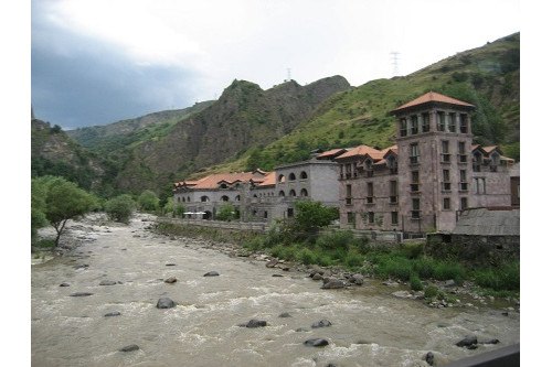
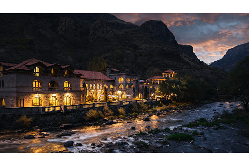
Here’s what one of the hotels looked like, with a simple “point and shoot” approach.


A castle-like building sits beside a rushing river and in front of green mountains.


It DOES look like a historic castle, and you DO see it’s right next to a rushing river and nestled in the mountains.  So, it definitely gives a sense of place and is “ok.”

Here’s what it looked like when the photographer got done with it.

A nighttime view of a castle-like building with dramatic lighting, which sits beside a rushing river and in front of a backdrop of mountains. This is the secret to a great tourism photo.


Listen, folks.  This was NOT a simple point and shoot.  We had no cell service and no radios to communicate with each from opposite sides of the river, and crossing that river was no picnic either.  Her trying to signal to me which lights to turn on or off, which umbrellas to move slightly left or right, and could I tilt that ONE light on the side to angle more toward the patio?  No, not THAT one.  THAT one.

Getting this shot took HOURS.  Actually days, because we had weather issues intervene.

But look at those two photos.  Which one stops your thumbs while scrolling and which one makes you say “OMG that place looks breathtaking and I want to go there?”

Great photographers do more than just click a button on a camera.  They harness the power of lighting, tone, context, perspective, props, spatial relations, and emotion.  In this case, the photographer studied the situation and said, “what photo…what angle…what perspective…what styling is going to show this building in the best, most seductive, most appealing way?”  And after taking a lot of test shots from various positions at various times of day, this nighttime photo won the honor.  (Should I mention how many design and travel magazines made this photo their centerfold?)

I mean…if your sister-in-law can do all that, then by all means lets hire her.

What’s My Point?

Getting great photography isn’t easy.  It takes time, planning, and commitment.  You may need to invest in props and other items to achieve the objective… flowers, food, drinks, people, and more.  You may need to reschedule (and spend money on a wasted day) because of weather.  If you’re already open, you may need to clear entire public spaces for several hours or a day – losing revenue from paying guests who don’t have access during that time.  You may need to take a shot over and over and over and over again to get it just right.  And damn it, you definitely need a professional photographer and/or stylist to do it justice.

Yes, all that costs time and money.  But the difference between “meh” photos and “great” photos is entirely about MAKING MONEY.  Skimp elsewhere if you must.  But do not skimp on great photography.

To further illustrate the difference, here are a few examples of photos I’ve come across in my tourism work.  Some of these businesses know the secret to a great tourism photo, and some clearly don’t understand what makes an impact.

By the way, there are deliberately no business names here.  This isn’t a commentary on who’s doing it right and who’s doing it wrong.  It’s an objective look at how photos do or don’t make a worthy impact.

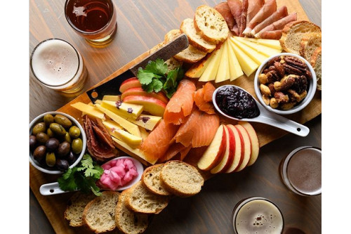
Everything about this charcuterie board screams “dig in.”  Lighting, color, texture, positioning.  This delicious photo was no happy accident.

A charcuterie board of food including apples, cheeses, veggies, crackers, nuts and more. This colorful, vibrant, well-light view is the secret to a great tourism photo.


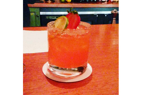
This cocktail gets completely lost in this photo.  It’s a gorgeous color, but sitting on that similar colored surface, the vibrancy doesn’t pop as it should.  Plus the background is super distracting.  If you’re a DIY Instagrammer for your business, and just taking quick snaps like this “on the fly” for posting, at least do this:  take that glass and snap pics of it in in a few different settings, and from several angles – high, low, above, side, etc.  If you take a dozen photos of this cocktail – which can be done in just a few moments – you’ll immediately be able to spot the one that shows the cocktail off to its best advantage.

An orange colored cocktail sits on an orange colored surface.


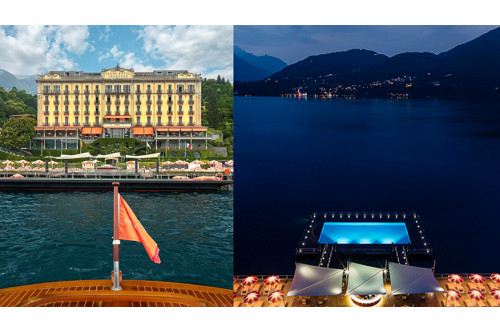
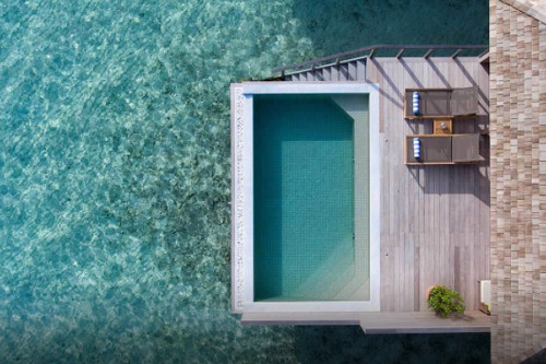
Let’s talk about dramatic architectural features, such as floating pools.  We once had a client that was debuting a floating pool and they fought us like the very devil about getting overhead drone shots of it.  They didn’t have easy access to a drone and didn’t want to pay for it.  But honestly, a straight-ahead shot of a floating pool just sucks all the drama out of that super-cool architectural feature.

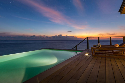
To illustrate, here’s a picture at another hotel of their floating pool taken from different angles.  You can see how one showcases the floating pool and in the other, it gets lost.

Left side shows photo of a large, many-windowed hotel, with a floating pool sitting in front of it. Right side shows that same floating pool at night, from an elevated perspective so the light blue of the pool glows brightly sitting inside the dark blue lake.


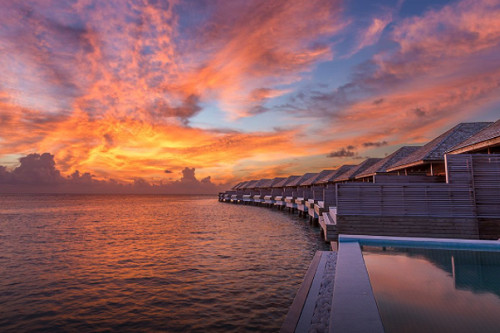
And these folks REALLY did their floating pool villas justice, ensuring their website gallery shows them from multiple angles and various times of day:

This captures the secret of a great tourism photo. A floating pool sitting on the edge of the ocean, with an attached deck that shows two lounge charis.


From the perspective standing on a deck looking out at the edge of a floating pool and the Indian Ocean just after sunset.

Standing on the edge of a floating pool at sunset, showing the perspective of multiple villas with their own floating pools stretching out before you. Sunset of bright orange, yellow, and purple.

From the perspective of laying in bed, looking out terrace doors to a deck with table and chairs, aqua colored floating pool, and the deep blue ocean.


Food shots need special attention because visuals aren’t necessarily the main sensory trigger for humans when it comes to food.  Taste, sound (sizzling, pouring, sauteing, etc.), scent, and texture all play a role in our emotional connection to food.  And that’s hard to communicate in a flat photo.

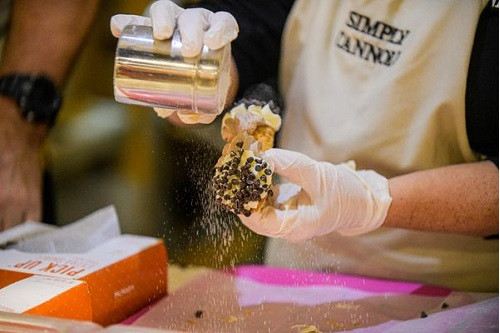
Here, capturing sugar in mid-shake on this cannoli gives more energy, life, and interest to the photo than just a static pic of a cannoli.

A person shaking powdered sugar onto a cannoli that's covered with chocolate chips.


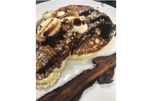
But these pancakes are nearly unidentifiable in this photo.  In the quest for a close-up to show the dripping, oozing goodness, perspective gets lost here.  If you’re scrolling quickly, you can’t even tell what it is, and that super-crisp piece of bacon on the side doesn’t help… it almost looks like the pancakes are sitting on a wood shelf.  Perhaps backing up the camera to show the whole plate, and catching the moment when the chocolate syrup is being poured onto the pancakes might achieve the objective better.  But – you know what I’m going to say – try it a dozen different ways before deciding which one makes the right impact.

A close up photo of pancakes with bananas and chocolate syrup on them and a crispy piece of bacon on the side.


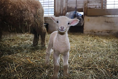
Oh, you’re taking pictures of animals?  NEVER just snap one-and-done.  You take tons of photos from multiple angles in order to get one that will stop people in their tracks.  Like this:

Picture of a baby lamb facing front and smiling.


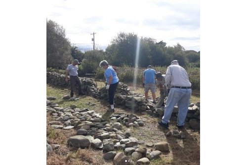
And finally, these folks are rebuilding a really important and historic wall.  But this photo will stop no thumbs.  I’m sure the dude on the right won’t be pleased that his behind is on Instagram, and everyone milling around looking down at rocks doesn’t do the story justice.  A close-up of a volunteer holding up a piece of rock with a huge smile on his/her face… or better yet, faux-kissing it?… could better tell the story of the passionate volunteers involved.  Or have him/her sitting on the wall and get enough context in the shot to see “kissing the rock” and the wall itself.  Or… hey, I’ve got an idea… take a dozen different shots and see what works best.  😊

Five people standing around piles of rocks, some of which are half-formed into a stone fence.


So, in conclusion, please do what it takes to get great tourism photos.  There’s really no secret to capturing ones that make an impact… just spend the time and/or money to do it right.

And let me just clarify:  by “great,” I mean photos that achieve your objective of inspiring people to emotion and action.  “Great” is one of those vague words that always need clarification and shame on me for using it so liberally in this post.  See why you should be careful using that word here.


Four Brilliant and Unexpected Marketing Partnerships

September 14, 2021

All good marketing partnerships need to be a win-win for the brands involved.  But brilliant marketing partnerships are also clever, unexpected, and make people say, “ok, now THAT’S cool.”  It’s not just that the benefit to consumers is valuable…it’s that the creation of the partnership itself makes an impression.

The partnership gods must be working overtime lately because I’ve seen four spectacular ones pop up in the past month.  These are worth a salute, plus they offer inspiration and learning opportunities for smaller, less well-funded businesses.

Before we explore them, it’s worth noting that in this context, a partnership is defined simply as two distinctly known brands coming together for a shared purpose.  It doesn’t matter who paid whom, or how the financial outcome gets distributed.  It’s about the brilliance of two brands unexpectedly aligning.  Ready?  Let’s go.


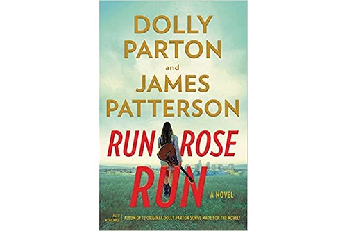
Cover of new book by Dolly Parton and James Patterson called Run, Rose, Run.

The Players:  Legendary country music artist/entrepreneur Dolly Parton and prolific author of thriller and mystery novels James Patterson.

The Partnership:  A thriller novel to be released in 2022 entitled “Run, Rose, Run” about an aspiring country music singer with a dark secret. The two are collaborating on plot and story elements for the novel, and Parton will simultaneously release an album of the same name, with 12 original songs inspired by the novel.

Why We Love It:  It’s a completely new idea.  An original book that promotes an original album…that in turn promotes the original book?  Each one draws the power of its distinct audience (Patterson book fans and Parton music fans) to inspire interest in the other. The cross-marketing opportunities are absolutely bonkers on this concept (“bonkers” being a highly technical marketing term for “limitless and insanely exciting”).  The book and the album are organically linked, so as you get vested in the characters and story through one, you are bound to be curious about the other.  And we’re just calling it right now:  there’s a Run, Rose, Run movie or streaming series in all our futures.

What You Can Learn:  Just because something’s never been done before, doesn’t mean it’s not possible.  Don’t just look for your partnership options among the usual suspects.  Can a hotel or destination partner with a band to write an original album based on its history and offerings?  Can a local coffee house partner with a local gardening supply store?  Can an amusement park partner with a haircare products company?  You bet.


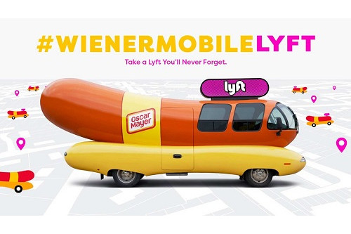
A picture of the Oscar Mayer Weinermobile, which is a vehicle shaped like a hot dog. This includes the signage of the Lyft brand.

The Players:  Food brand Oscar Mayer – well known for its wiener hot dogs – and popular ridesharing service Lyft.

The Partnership:  From August 25-27 in Atlanta, New York, Chicago, and Los Angeles, riders who hailed a Lyft XL could have been surprised by a pickup from the legendary Oscar Mayer Wienermobile.  Not only did that come with bragging rights and shareworthy content for the lucky riders, but the ride was free and they got swag.

Why We Love It:  First of all…it’s hilarious.  And after the wet blanket purgatory we’ve all experienced from the pandemic, frivolous fun is a welcome change.  But also, it’s a brilliant partnership because it has so many layers.  There are PR opportunities before, during, and after each rideshare blitz. The Wienermobile gets to cruise the streets for three days in four major cities.  Odds are at least some of the riders have decent social media followings and will share with glee.  And highly arresting video/photo visual opportunities exist across a ton of marketing channels.

What You Can Learn:  This partnership is all about providing the element of surprise to guests.  Lyft ride hailers expect a typical SUV to arrive for their pick up… they will lose their minds with joy when the Wienermobile shows up instead.  Where can YOU provide a pop of unexpected joy in what would otherwise be a typical, ordinary experience for your guests?


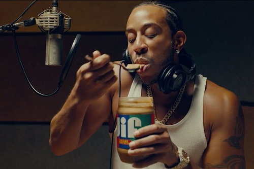
Rap artist Ludacris takes a spoonful of Jif peanut butter from the jar while standing in front of a microphone in a recording studio.

The Players:  Popular peanut butter brand Jif and successful rap artist Ludacris.

The Partnership:  The two teamed up for a commercial that shows Ludacris trying to record a new rap song and failing miserably with each take.  Then, after eating a huge spoonful of Jif in between takes, he nails it…because the way the peanut butter sticks to his mouth and makes him mumble is the PERFECT style for his new song.

Why We Love It:  Whether you love rap or not, it’s a common observation that it’s often really hard to understand what’s being said in a rap song.  And whether you love peanut butter or not, everyone knows peanut butter has the pesky tendency to stick to the roof of your mouth.  So the fact that BOTH brands involved were willing to poke fun at themselves with this collaboration?  Genius.  Whoever thought of this partnership deserves a medal.

What You Can Learn:  Let your hair down sometimes.  People love humor and they love when a brand is both humble and confident enough to admit their “flaws.”  Note that the flaw you cop to can’t be a serious thing or else poking fun at yourself will backfire.  Like, if you’re known for paying poor wages or implementing poor environmental practices, you definitely don’t want to draw scrutiny there.  But if – for example – you’ve got notoriously long wait times at your restaurant, you can certainly turn that into a positive and have fun with it instead of ignoring it.  See how this eatery in Colorado made it work.


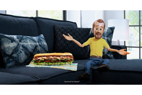
A picture of a subway foot-long sandwich and the mascot from Bob's Discount Furniture sitting on a blue sectional sofa.

The Players:  American fast food restaurant franchise Subway and multiple businesses in local markets, including Bob’s Discount Furniture.

The Partnership:  As a way to break through the clutter and gain attention for its new menu items, Subway is doing a “takeover” of TV commercials from other advertisers.  Here’s what happens:  a Subway ad listing all its new menu items gets cut off before finishing…and then when the next commercial starts for a different advertiser, Subway interrupts the commercial and takes over the ad.  All the partner advertisers still get to hawk their own products.  The “takeover” commercial is a jointly produced, shared spotlight.  See the Bob’s Discount Furniture takeover ad here and see other Subway takeover ad partnerships here.

Why We Love It:  Lordy, it’s hard to get folks to pay attention to commercials.  But this quirky, untraditional approach is bound to cut through the clutter.  Regular TV viewers who are only half listening and already desensitized to hearing endless Subway commercials and endless Bob’s Discount Furniture commercials are likely to stop in their tracks to see/hear something they never expected:  Furniture mascot “Little Bob” selling Subway sandwiches.  This is true of all the takeover ad partners, like the local personal injury lawyer whose long-standing ad you could recite by heart, or the car dealership whose jingle gets stuck in your head all the time.

What You Can Learn:  Never say never, y’all.  Not only are these partnerships completely unexpected from brands that are completely unrelated, but also…really?  Sure companies have bought ad space from each other before, but it’s usually done so one can OWN the space…not so they can share it with a joint “takeover ad.”  Maybe you can’t afford your own local TV ad spots to allow enough frequency to penetrate consumer awareness, but what if you found a partner or two and created collaborative ads?  And this is not “you take the first 15 seconds and I’ll take the last 15 seconds.”  Rather, it’s more like “let’s marry our messages and have some fun.”  Again, going back to the local coffee house and the local gardening supply company…no one would EVER expect to see them marketing together, so a collaborative TV ad might just snap folks to attention.

These brilliant partnerships all capture the spirit of surprise because no one ever expected these brands to pair up.  And the element of surprise is a gift to marketers everywhere.  People love to be caught off guard with something atypical that’s also positive, clever, and joyful… see how we partnered MSC Cruises with automaker FIAT in a way no one ever expected. Tap that vein of “surprise” marketing goodness whenever you can.

And pssst… this doesn’t just work for partnerships.  Look at how Book Culture surprises its shoppers.

Write better copy with patience and a thesaurus.

July 14, 2021

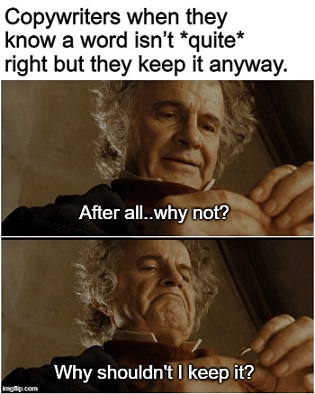
A meme featuring bilbo baggins with text about using patience and a thesaurus copywriting

If you’re looking to write better copy, I hope you possess patience.  Because that’s really what it takes:  patience and a thesaurus.  Here’s how those two things combine to make you a better writer.

First, what do I mean by “copy?”  For the purposes of this post, I mean the broadest possible definition of the word:  quite simply, any text in any form.  This includes ads, social media posts, email messages to colleagues, texts to friends, cover letters for job applications, and much more.  Literally ANY text.

Second, here’s a fact about writing:  shorter is always more effective because attention spans are limited.  What do I mean by “shorter?” I mean using the fewest words possible to articulate your point. Many folks set out to articulate their point.  But they don’t also strive for doing it in the shortest possible way.  Achieving both of those two goals simultaneously is neither quick nor simple.

I do NOT mean that your overall copy length can’t be long.  Heck, Harry Potter and the Order of the Phoenix is 870 pages long and I was glued to that book until the very last word.  But that actually proves my point.  J.K. Rowling is a master at descriptive, precise writing that evokes imagery with the fewest words possible.  870 pages from her doesn’t feel tedious.  Were she not such a master at this, it likely would have taken more than 1,000 pages to tell the same story, and THAT would be tedious.

The point is…you could zip through writing copy without investing the time to precisely articulate your words in the shortest possible way.  Maybe you used three sentences to communicate something that could have been said in one sentence.  Or you used a four-word-phrase instead of a single word because it came to mind first.

If you write your copy that way, here’s what you’re doing:  you’re putting the burden of time on the reader to sift through all the extra words to arrive at your point.  That likely matters less when you’re texting with a friend about your favorite TV show.  It matters a LOT when you’re trying to persuade a reader to do/think/feel something.

So, especially if you’re in marketing, you need to be the one who assumes the burden of time in writing.  The more time you take to make each piece of written communication shorter AND effective, the less time the reader is forced to invest in embracing your point.  If you make it too cumbersome for them, they’ll just tune out or move on long before your point has been embraced.

That’s where my advice of “patience and a thesaurus” comes in.

Nouns and verbs all have connotations.  These nuances give additional descriptive power to a single word by *slightly* altering the feeling/imagery it evokes.  For example, there are 44 different words in thesaurus.com to describe something as “difficult.”  So if you’re using that word in writing… do you mean – say – ambitious, problematic, arduous, immense, or challenging?  All of those words could be classified under the heading of “difficult,” but each one also nods to the reason why something is difficult. And therefore, each one tells a different story.

And that’s the secret right there.  You need to employ patience and a thesaurus to identify words that – by their very connotation – help you articulate the story you’re trying to tell.

Here’s an example I see a lot in the tourism marketing strategy work we do.  A lot of organizations use the term “boundaries” or “parameters” in conjunction with big plans, projects, and initiatives.  Those terms are meant to describe guidance given as the work proceeds to prevent straying from the plan.

But it’s possible in many cases that what the organization really means to describe are “guard rails.”  Boundaries and parameters imply limits and fences around the whole project, whereas guard rails connote a limitless, unobstructed path with some assistance to keep things moving forward.

Figuring out whether boundaries, parameters, or guard rails tells the appropriate story just takes patience to think it through and, if necessary, a thesaurus check for more precise options.

In a more marketing-oriented example, look how the connotation of the experience you’ll have differs depending on the verb chosen:

  • You’ll be amazed by your experience.
  • You’ll be delighted by your experience.
  • You’ll be inspired by your experience.
  • You’ll be transformed by your experience.
  • You’ll be tickled by your experience.
  • You’ll be giddy from your experience.
  • You’ll be left breathless by your experience.
  • You’ll be hypnotized by your experience.
  • You’ll be enchanted by your experience.
  • You’ll be moved by your experience.

All of those are far more descriptive than saying “you’ll have a great experience.”  That’s because “great” tells no descriptive story other than having a vague positive connotation.  I call it an empty word, and you can see why you should stop using it here.

You can also find four really great powerful tips to strengthen your writing here.
Even the word “better” in this blog post’s headline isn’t an ideal word choice.  “Better” is a nondescript, vague term that could benefit from a more descriptive upgrade.  In this case, it could be:  Write more persuasive copy.  Or write more effective copy.  Or write more descriptive copy.  Or compelling.  Or potent.  Or -ooooohh – how about irresistible?  There’s something delicious about evoking the vibe that your copy is something people can’t resist reading.

But alas…this is a blog post.  And “better” is a more appropriate choice to match searcher intent (not many folks are searching for “how to write irresistible copy”).  SEO writing is a whole different ballgame, so if that’s your goal, you should also check out these tips.

The Hiring Chain video: great idea, brilliant storytelling.

April 23, 2021

If you’ve not seen The Hiring Chain video, get ready for a great idea and some absolutely brilliant storytelling.  And it’s not just because legendary music artist Sting is performing the tune.

Click image to watch:


GREAT IDEA

First, let’s talk about the idea as it relates to tourism and hospitality.  As the industry roars back from the pandemic, there’s a definite labor shortage on the horizon. Housekeepers, groundskeepers, gardeners, kitchen staff, maintenance and custodial staff, and so much more will be needed.  It’s entirely possible many of these roles can be effectively filled by people with Down Syndrome (which, FYI, is often written as “Down’s Syndrome” too).

CoorDown, the awesome organization that produced the video, has a helpful website on the subject.  Here’s a link to their hiring page to learn more about hiring in your country.

BRILLIANT STORYTELLING

Second, let’s talk about the brilliant storytelling this video achieves, and why.  Marketers, take note:

  • By using the generic career titles – baker, farmer, dentist, barber, etc. – the viewer gets a feel by osmosis for the variety of jobs possible for Down Syndrome workers.
  • By the time the lawyer hires John, it’s clear how the story is unfolding and the viewer starts to anticipate what comes next.
  • The music tempo and vibe emotionally carry the viewer through this journey.  When the baker walks into the barber and the music slows down, it fosters an “a-ha” moment.  The brain has a chance to stop and realize how that whole hiring chain was connected.
  • The ending sequence is pure magic.  Just the simple act of speeding up the tempo implies quantity and depth.  Without saying it in words, it’s like saying, “You see how many jobs were filled and opportunities given just because of that one first move by the barber?  We had to speed things up just to fit it all in.”

It goes without saying that the video production is spot on…and yeah, it doesn’t hurt that Sting is performing the song.  AdAge said it best… “it’s like a jazzy nursery rhyme.”

When you plan your next video, take a page from great and brilliant Hiring Chain video.  They didn’t spell out much in black-and-white words, yet the combo of visuals, scenes, and music told the story better than any descriptive narrative would have.

BTW, you can use a similar storytelling concept with signs.  See some of our faves here.

Here’s what “living the brand” really means.

November 5, 2019

There’s a store in Brooklyn called The Superhero Supply Co, which sells – among other things – a fine selection of capes, cans of antimatter (sizes: large and small), and sidekick utility belts (assorted colors).  It’s not a party/costume store, where you’d go to buy a signature Captain America shield or Wonder Woman golden lasso.  It’s where a REAL superhero would shop for his/her OWN gear.  Quite literally… a supply store for superheroes.

Until you get to the shelving on the left side of the back wall.

Brooklyn Superhero Supply Co hidden doorOne section of the fully-stocked shelves actually swings out (if you know the trick) as a secret door.  What’s behind the secret door?  A classroom, where kids can experience workshops to foster their creative writing and imaginative thinking skills.  There are evening and weekend sessions for kids aged 6 – 18, and they also offer after-school programs, host school field trips, and more.
Think about this:  the entire purpose of this business is to inspire kids to release and cultivate their imagination.  Would this be possible in an ordinary classroom?  Sure.  Is it 10,000 times more effective in a hidden classroom that’s the secret identity of a store that sells supplies to superheroes?  Duh.  Their imagination is sparked before that hidden door even finishes swinging open.

THAT is what “living the brand” really means.

It’s not about having a carefully-crafted mission statement and/or brand positioning written down on paper…it’s about how that mission and positioning come to life at all touchpoints of interaction with your audience.  It’s not saying you’re something.  It’s being that something.  As the ol’ saying goes… walking the walk, not just talking the talk.

Let this magical place inspire you to evaluate your OWN state of “living the brand.”

We see brand-disconnects all the time in the tourism industry, such as…

  • Hotels that say they’re gracious, yet nickel and dime guests with fees at every turn.
  • Destinations that say they’re artsy, yet feature boring, standard wayfinding tools onsite and online.
  • Ski resorts that say they’re edgy and epic, yet offer typical F&B options and vanilla interior design.
  • Attractions that say they’re fun, yet make ticket-purchasing and parking acutely painful.

Listen…I get it, it’s hard to live the brand.  Who wants to give up fees?  Or convince owners to invest in renovations?  Or fight town councils on signage regulations?  Or – WTF, Chris? – figure out a way to make parking fun?

But “living the brand” makes marketing’s job less expensive and more effective.  Your marketing dollars will have to work less hard to keep guests tethered, and – even better – transforms them into ambassadors, inspired to share your story with the world.

You may think it’s no big deal if you’re not living the brand at every single turn, but each off-brand touchpoint is sabotaging your trust with guests.  And an erosion of trust sabotages loyalty.  And a lack of loyalty ultimately means…buh-bye.

So, even if the step-by-step impact is intangible to measure and impossible to trace, living the brand is vital to your business goals.  Strap on your own cape and find a way.  The ROI is worth it.

For more information about the creative engine behind the Superhero Supply Co, click here.  Superheroes in Brooklyn, big foot hunters in Boston, secret agents in Chicago, time travelers in LA, and many more…the business concept is just pure magic.