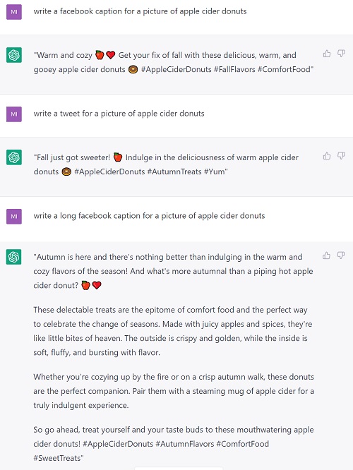
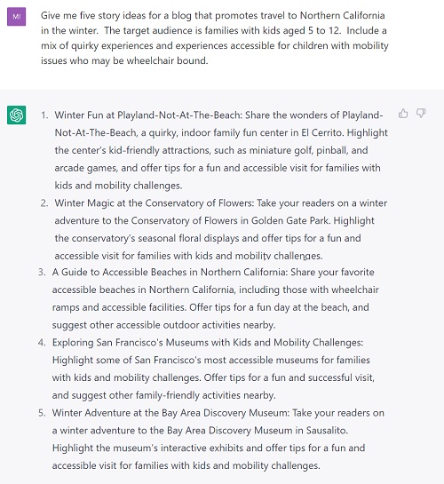
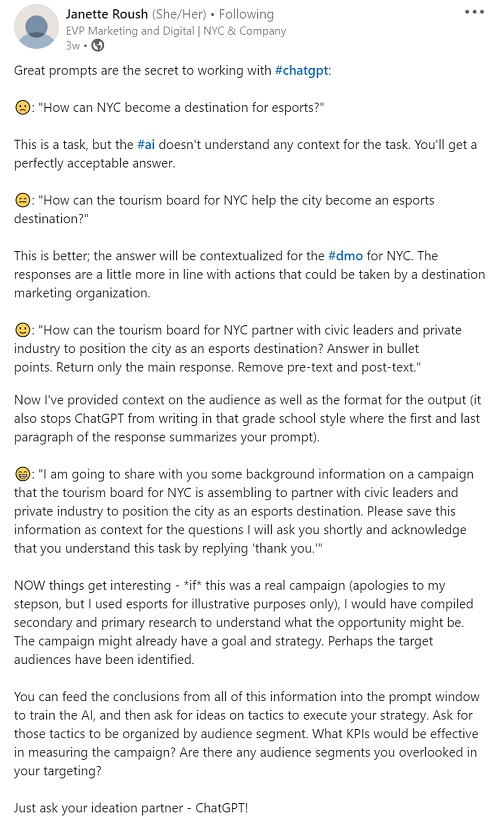
get travel marketing tips
 If you’re using a slide deck to present to an audience, three components must work in harmony to fuel its success:
- Content: the material you’ve chosen to include in the presentation.
- Delivery: how you present…tone, style, engagement, interaction, vibe.
- Design: the layout – format, text, visuals, graphics – of the presentation slides.
We’ve covered how to up your game on content and delivery elsewhere, so now let’s focus on design.
I’m going to be blunt:
It doesn’t matter how interesting your material is or how charismatic you are as a presenter.
Why is that true? Because, while sitting in the audience, a person’s brain is tasked with splitting its attention between what you’re saying and what it’s seeing on the screen. And if their brain has to work too hard to process what’s on the screen, one or all of these things will happen:
- They’ll stop listening to you as they concentrate harder on trying to read the screen.
- They’ll realize (whether consciously or unconsciously) that they can’t listen to you AND read what’s on the screen, so they’ll just give up and let their mind wander elsewhere.
- They’ll get annoyed because of the friction this distraction creates for them.
Surely you’ve felt this happen to you as an audience member before, right?
It’s wild that SO MANY presenters make design choices that are not user-friendly for the audience. Well… it’s probably not that they “made” those design choices. Rather, they likely just didn’t think about it at all. They simply dropped words and visuals on slides to create a presentation, without considering how it will look and feel to an audience that’s trying to follow along – especially those folks sitting way in the back of the room.
So, if you want to make it easy for people to pay attention to your presentation, avoid these five common presentation design mistakes:
1) Font too small, light, or unreadable.
What looks legible on your small computer screen (while you’re sitting right in front of it) isn’t always readable for an audience at a distance, whether that’s at the other end of a boardroom table or the back of a huge event space.
When a font is small, or frilly/fancy, or light in color, or light in width/density, it literally makes it impossible for the audience to decipher.
It’s best to favor big, bold, clear, and simple fonts in a presentation. And if your brand standards don’t align with that…too bad. I’ve seen too many presenters use completely unreadable fonts – like brush script and light colors and thin widths – because it matches their brand and “branding comes first.” Nope nope nope. Not when it comes to presentations it doesn’t. In presentations, USER EXPERIENCE comes first. Trust me, if the audience can’t read what’s on the slides, it doesn’t matter one bit that it’s “good branding.” In fact, that would sabotage good branding because it aligns your branding with a negative touchpoint for them.
A lot of presenters choose a small font because they’re trying to fit more words on each slide, so that they can have fewer slides. The thinking here is that fewer slides = a shorter presentation. That is 100% untrue, which is a perfect segue to review mistake #2.
2) Slides too cluttered with text, visuals, or both.
The length of a presentation isn’t dictated by how many slides you have. It’s based on how much material you have to present. I can make a 10-slide presentation last for an hour, and I can also comfortably fit a 90-slide presentation into an hour. It just depends on how I choose to organize the content on each slide.
When choosing how much text/visuals to put on each slide, the key here is to think, “what’s going to make it easy for the audience to follow along?”
Take this slide, for example, which might end up sitting on the screen for 5 minutes while you explain each bullet:

It’s so dense for the audience to look at, even if you were to animate each bullet and make them appear one at a time as you go through them. And if you try to add space between each bullet just to make the slide easier to read, you end up having to make the font even smaller so it all still fits on one slide. Either way, the net result is a cluttered screen for the audience that’s difficult to read and (let’s be honest) kind of annoying.
Alternatively, you can spend the same 5 minutes covering that same material by separating each bullet point out onto its own slide, like so:
Yes, now you’ve just turned one slide into five slides, but who cares because it doesn’t change the total amount of time you spend on that section.
This option is WAY BETTER for the audience. Not only can they see and read the words easily, but it’s more engaging for them to follow along. There’s more movement on the screen (which subconsciously signals them to pay attention so they don’t miss anything) and the words they’re seeing up there are a clear, direct match for exactly what you’re saying. So you can make the point, expound on it a little bit while holding their attention, then move on to the next slide…make the point…expound… and so on.
And yet again, we have a perfect segue for reviewing mistake #3.
3) Reading slide text word for word and adding nothing beyond that.
This is where “design” and “delivery” intersect. To keep the audience engaged throughout your presentation, it’s important that you frequently expound a bit on each slide’s written content.
Why? Because simply reading slides word for word desensitizes the audience. You’re giving them no reason to listen to YOU if all they need to do is read the slides themselves. And that’s just another way you risk losing their attention.
Rather, what you want is to “train your audience” that sure, you’ll read what they can see on the slides, but sometimes, you ALSO go off script and add more color/explanation to a point. That creates a dynamic where they feel like they must pay attention or they might miss a great nugget of information.
This is also helpful for you as a presenter, because you can use this strategy to provide yourself with cues/hints, while simultaneously ensuring that your slides aren’t cluttered.
In a recent presentation, I needed to tell the story of how Hawke’s Bay, NL’s Torrent River Inn impressed the hell out of me with their guest service. This slide gave me the cues I needed to cover the points I wanted to remember to make, while also giving the audience the gist of the story.

I didn’t need 8 bullets of material to remind myself what to say, and so this was a way to spare the audience from all that clutter.
Which is, again, a fabulous segue to review mistake #4.
4) Including no visuals.
Visuals are like eye candy to the audience. It’s essential that you find a way to add visuals to your presentation. It makes it much easier for the audience to pay attention to text when they get periodic relief from arresting, easy-to-see visuals.
Not every presentation lends itself naturally to visuals, however. So then, you have to find creative ways to add them. And they need to feel organic, not forced.
For example, look at the difference between these two slides introducing a section of content about evergreen trends in a presentation:


The plain one is fine, and certainly legible, so it will do the job. But the one with the photo of the trees as the backdrop is much more vibrant and appealing. It gets the job done while ALSO engaging the audience with a pleasant feeling. It gives them something that grabs their attention.
But you have to be careful here, as adding in “visuals for the sake of visuals” can sometimes have the opposite effect, creating a distraction instead of engaging attention. And that sets us up for reviewing mistake #5.
5) Distracting graphics and visuals.
Often, in a quest to make a presentation more visually appealing, some presenters add lots of graphics and images that have no clear sense of purpose to the content at hand. And guess what? The audience can tell they have no purpose.
If you add random graphics to a slide just to make it less text heavy, there must be a relevant reason for them. Otherwise, people’s brains will get distracted trying to figure out what that thing is and why it’s there.
The same thing goes for images. If an image will help you tell a story, use it. If it won’t, but you try to shoehorn it onto a slide just to balance out some text…then that’s a distraction.
Plus, if you’re adding photos to a text heavy slide to make it more “balanced,” then you’ll probably have to make the font smaller to accommodate it. And this will cascade into mistakes #1 and #2 above.
So, overall, if you want to avoid the five common presentation design mistakes reviewed in this article, just remember: simple, clear, bold, and big. For each slide you create, picture yourself in the back of the room and say… “Would I be able to see/read that?” And if the answer is no, or even just “I’m not sure,” then figure out how to approach the design of that slide’s content a different way.
PS on visuals:
If you’re not using your own photography, then be aware of when licensing will be required to use images. Here’s a guide to that.
Also, some visuals are appealing…some aren’t. You want to use appealing ones (duh) so here are two refreshers you might find useful: